How the visual style of the game LandLords was created
This article is based on my personal experience. In it, I’ll talk about the challenges that freshly-minted indie developers face before their project finds its own FACE — a recognizable style.
A Metaphorical Introduction
I’ll begin poetically and broadly. When the idea to create a game by yourself pops into your head, and instead of forgetting the dream by morning, you actually get down to business, it’s like an earthquake.
All around you, house-sized boulders of raw game concepts and mechanics are bouncing, threatening to crush your enthusiasm. The trembling ground of technical approaches is constantly shifting under your feet. You’re deafened by the roar of erupting clashes between viewpoints that seemed to align just yesterday: “Technology is key!”, “Vision is key!”…
This is challenging even for people who have worked in the industry for a long time and think they know it from the inside out. Don't panic 😄 this situation is normal. Take a deep breath in, breath out, systematize your efforts, and most importantly, get used to the fact that it's impossible to avoid mistakes and get everything right on the first try. After a while, the boulders will break down into rocks, and the rocks will crumble into grains of sand. Then, where a catastrophe on the scale of “The Last Day of Pompeii” once unfolded, a harmonious and distinctive new landscape will emerge. That sand, hardened by lava into rock, will become the foundation. And hundreds of thousands of tourists, travelers, and adventurers from all over the world will come to wander its picturesque hillsides…
The Journey Begins
When we started developing our debut game project, LandLords, none of us had any leadership experience. We knew our professional fields, how processes work in companies, and we understood timings and technical requirements for tasks. But in companies, the high-level vision of a project is dictated by the executive heads.
That’s why, despite the internet being full of guides on how to start making games, developing a project as a product owner is not easy. In real life, things are much more complicated than they seem in words and videos.
The project has been developing for 1.5 years, but we started working on it long before the result even remotely began to resemble what it is today. The period of preparation and iteration cannot be overestimated. This is where the combination of features is forged that will eventually attract the first enthusiastic players. And this process will have to be repeated with every new game, unless you plan to endlessly clone your own project, like in hyper-casual.
I am a 2D generalist artist with 13 years of experience, and on this project, I am responsible for the visuals first of all. In a tiny, self-funded team of two like ours, everyone has to juggle 3-4 roles simultaneously, but that's a topic for another conversation.
References and Color Palette
The search for a visual style began with a question: what feeling will users have when playing our game, and what examples evoke the desired visual sensations? This is the initial search for references. I put there my own impressions from competitor games as well. We want to make something more appealing than what they have.
Besides the obvious screenshots from suitable games, I spent time on Pinterest, collecting images that matched the vibe and visuals into a folder. In some, I saw shapes similar to what I needed; in others, a color palette; in a third, a nice render.
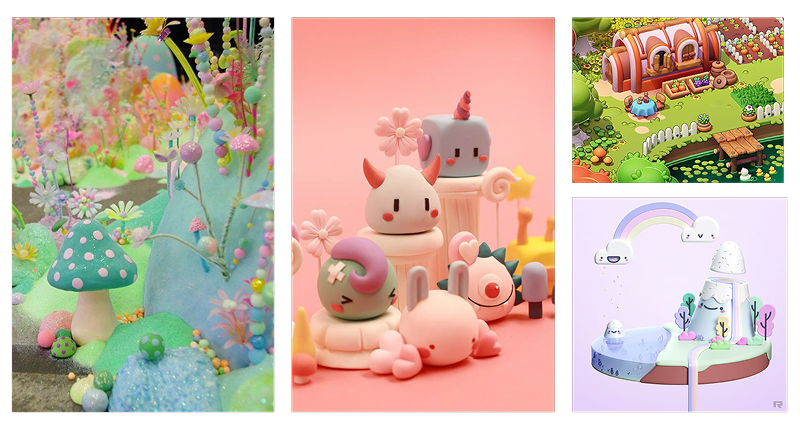
The color scheme was born first. This component sets the atmosphere that the player will perceive from the first seconds in the game, from a glance at the cover in the store. What awaits the user: a calm walk through a summer grove or a tense stealth mission in the gloomy ruins of a dead city?
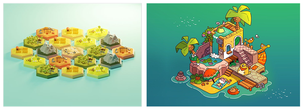
I took 5-6 images featuring hexagonal building strategy games and a set of artworks with a whimsical, fairytale atmosphere created mostly by color and light. I used an eyedropper to pick out the basic colors I liked and played with the shades. Keeping in mind that you can't ignore the player's established experience—and that pink grass instead of green is a questionable idea — I chose a suitable palette from the ones I had created.
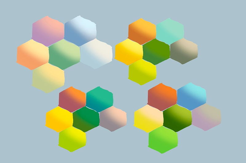
Defining the visual style was much more difficult.
Wandering the Path of Iterations
LandLords is a browser game based on a popular board game. This immediately implies a number of conventions. In other words, hyper-realistic visuals are unnecessary here. But a cute “world in a box” feels closer. In my work, I prefer stylization, and I enjoy art created in a casual style (in terms of its approach) that is expressive and original.
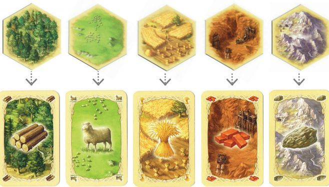
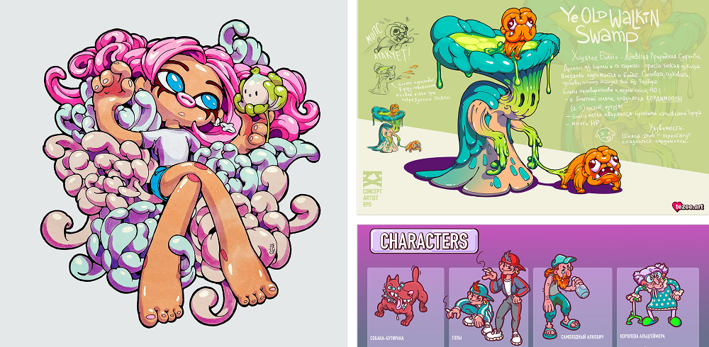
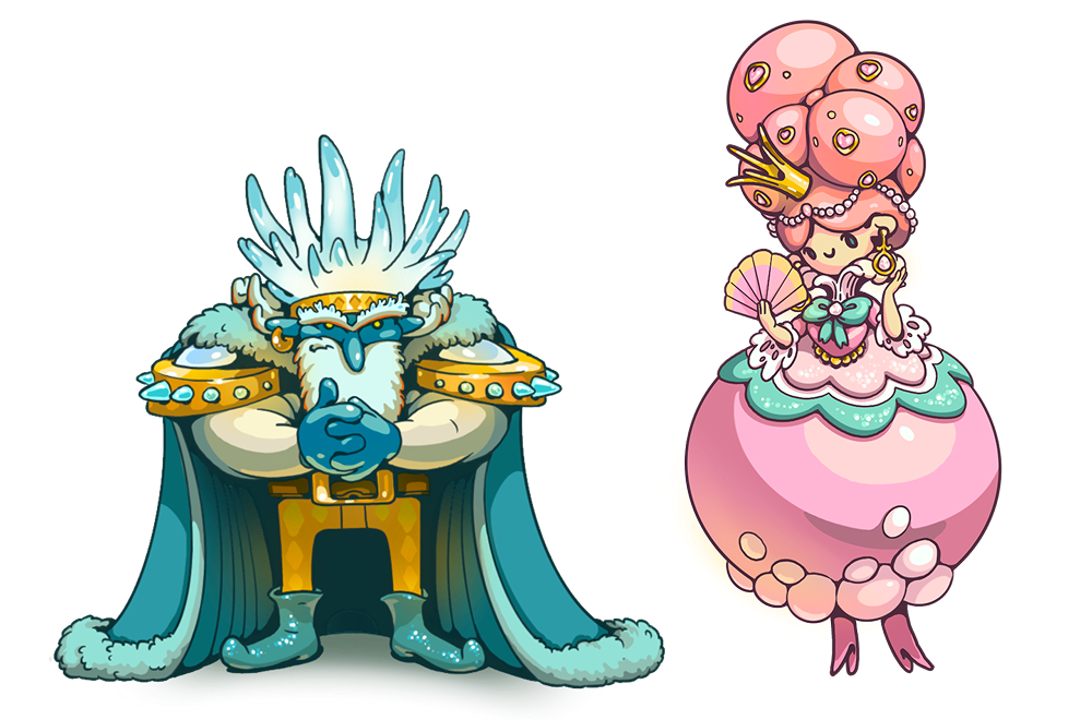
The aesthetic of the cartoon “Adventure Time” also served as an inspiration. Among the reference pictures, I found some where inanimate objects, like mountains, the sun, or trees in a forest, had little faces. Guided by this, I sketched out general drafts for each hex type in broad strokes, but the style of the final render was still up in the air…
The First Failed Iteration
At the beginning of the search, the idea of creating the visuals in 3D was floating around. The only problem was that no one on the team was proficient with 3D editors at a professional level. Other thoughts led to the casual style of the old mobile game “HayDay”.
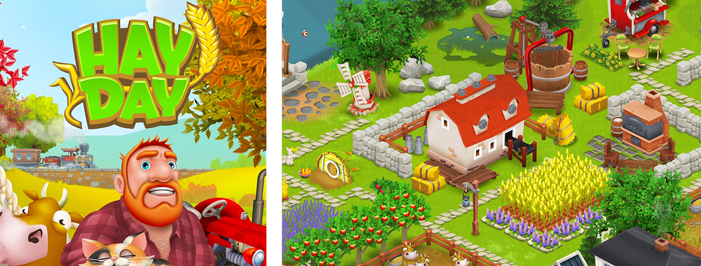
The game was released in 2012 and became the benchmark for casual stylistics for a long time, which was later pushed to its natural peak by companies like Playrix. This style became a common name: “the Playrix style, render”. Since it had become tiresome for users over more than 10 years, the “casual” style which was mostly understood as this Playrix-like one, came to be seen as something folksy, outdated, and unoriginal.
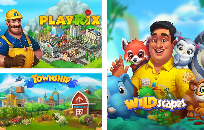
In reality, the casual style is a set of characteristics related to the method of depicting objects. Therefore, artworks made in a casual style can differ greatly from one another.
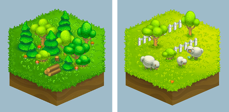
I started my rendering experiments with a style close to Playrix's: soft shadows, a subtle outline or none at all, and 3D-like volumes. Soon, two serious problems became apparent.
First, the art was well-executed but looked unoriginal. Looking at it, the thought that came to mind was, “I've seen this a dozen times before”. This was off-putting and made the game feel like “just one of many”.
Second, this type of rendering took a lot of time. This is a major red flag when you're an indie team with limited human resources. If one person is responsible for all the visuals on a project, from concepts to backgrounds and buttons, it's crucial that they can create the necessary content without burning themselves out. And so, the first iteration of the search came to an end.
The Second Failed Iteration
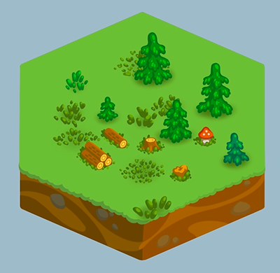
After the painstaking process of drawing in the “Playrix style”, I thrown myself to the opposite pole: drawing with minimal time investment. This shot in the dark brought nothing but a wounded duck of shame. For the sake of speed, I abandoned outlines and drew objects with flat shading in two colors: the object's own color and a shadow. It turned out horribly, as if I had suddenly forgotten how to draw and give art expression. Since it “didn't work out” quickly, I'm glad I didn't waste much time on the second iteration.
The Third Failed Iteration
The third iteration lasted longer than the previous ones. And here, I fell into the most unpleasant and dangerous trap — scale.
While I was working in a company, art tasks came with a specified resolution and scale. I knew the size of every element on the screen, and avoiding the noise of unnecessary details was easy. The fact that the projects the studio worked on didn't have scene zooming also played a role.
Now, being my own art lead, I drew objects without a second thought, not even considering the zoom level of the canvas.
At that time, I didn't have a second monitor, so there was nowhere to immediately compare the art at its proper scale in the scene and realize WHAT a crap it was. The work on the game art continued blissfully. The style seemed close to what I wanted: 2D with outlines and moderate flat-shade coloring, not overly stylized. But you couldn't call it realistic or semi-realistic either.
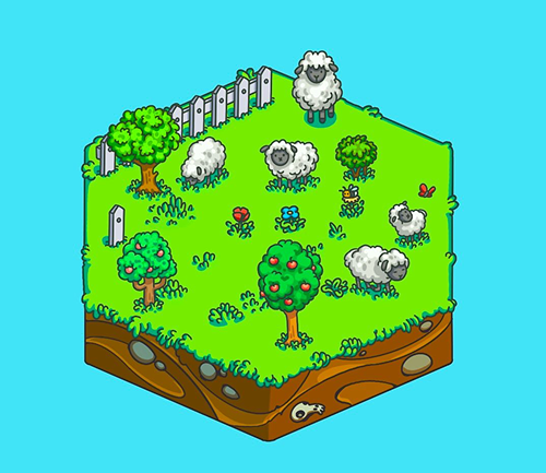
We also decided that objects like trees and bushes would be arranged in 3-4 variations for each hex type to add visual diversity to the game. This was also a mistake.
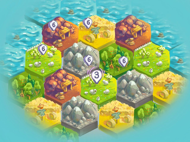
The player gets used to the idea that a specific type of hex yields a specific resource. To avoid confusing the player on the map, each hex must be immediately recognizable and associated with its resource. But if you make a dozen different configurations for a “forest” hex, for example, it slows down visual recognition and will later frustrate the player.
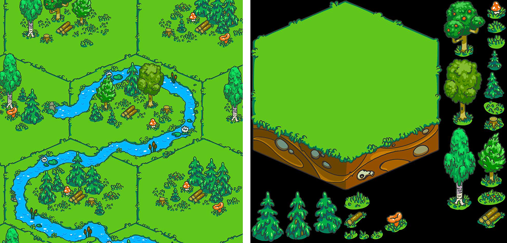
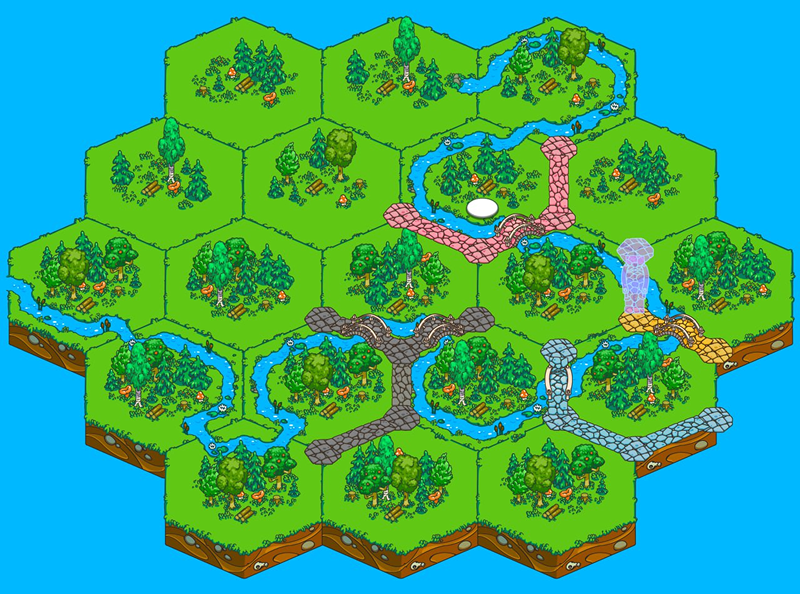
Without finishing the hex types in detail, I moved on to the roads to create a rough map and see how it looked live. How fortunate that we decided to check. In the game today, it's impossible to zoom in on the map as much as I was zooming in on the canvas while I was drawing!
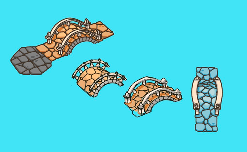
As a result, the scaled-out scene presented the viewer with a mess of tiny details, lines, and spots that merged into a uniform noise. And so, the third iteration failed.
Lessons Learned from Hard Mistakes
The trial and error took a year while I was still working my corporate job. This wasn't a significant loss, as my partner, 13luck, was simultaneously going through his own path of trial and error. But by the fourth, final iteration, I was armed with knowledge of the rakes I had stepped on over the past year. So, where did I add some pillars?
Scale
This was a painful and time-consuming mistake. To avoid repeating it, I took a screenshot of the game map at the scale the player would see it. Now, I draw objects either with this screenshot as a background layer or next to already drawn elements to maintain the correct level of detail.
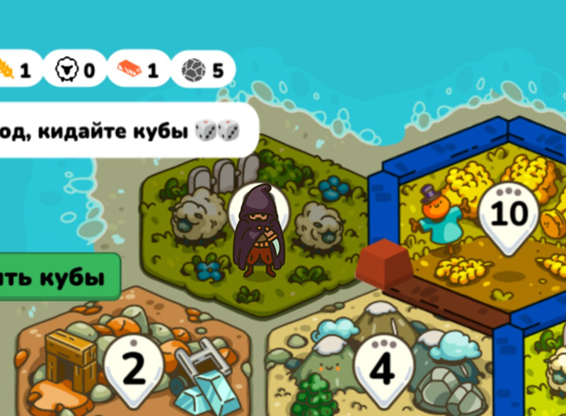
As a way to avoid this mistake, I recommend keeping a view of the canvas WITHOUT zooming in front of you while working on a tablet. Or constantly zoom out the art you're drawing to its presumed minimum scene size. Eventually, you'll develop a sense of acceptable detail for the art of a specific project. I also upgraded my tech park with an additional monitor, which also helps with the sense of scale and detail.
Work Speed
While working on tasks, an artist develops an internal understanding of how much time they spend on what. The longer you work in the industry, the more accurately you can estimate task deadlines.
Putting stylistic considerations aside, 2D flat-shade art with an outline is faster to create than a soft render with volumes in the Playrix style.
Furthermore, our game scene doesn't rotate, it only pans and zooms. This means objects are drawn from a single projection. Understanding how the project is structured and how its entities work helps in choosing the right method for creating art, allowing you to discard excessive ones.
Finally, a significant role is played by what kind of art, and in what style, an artist can produce easily, quickly, and with pleasure. From here, we move on to style…
Visual Style
So much time was spent searching that year, even though the right solution was right under my nose!
By that time, I had been developing my “bubble-lips” style for three years, a style I had once created myself. It has distinct features, rules, and acceptable variations. I could draw art in this style not only with pleasure but also quickly! After the third attempt to find a style for the game, 13luck asked me why I was looking elsewhere instead of relying on what I already had and knew how to do. That was the turning point.
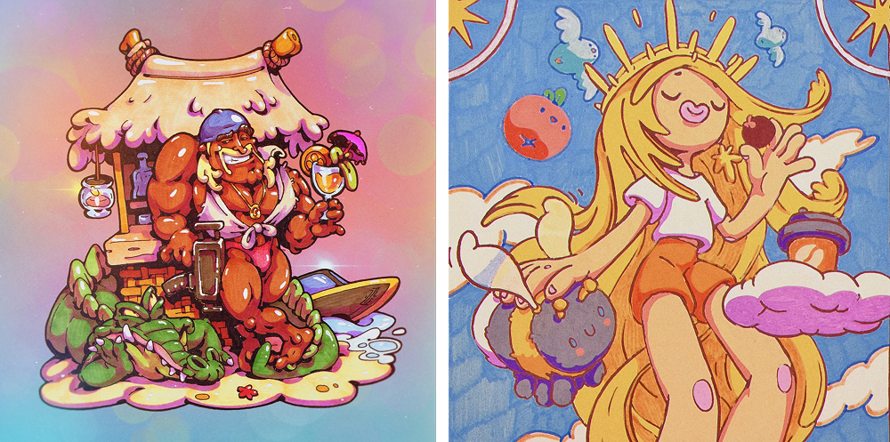
The “bubble-lips” style is characterized by grotesque generalizations and roundness, you could even say “bubbliness”, classic casual techniques where there are few small details, and objects are built more on large and medium shapes, retaining their integrity and recognizability. The coloring in this style was also based on moderate flat-shading. There was just one nuance left: drawing character faces. Here, the references from “Adventure Time” came to the rescue. As soon as I started creating graphics for the game in my own established personal style, the work went way faster.
And It's Not Over Yet!
Even with all that, mistakes and corrections still happened during the process.
For instance, achieving the right density of objects in the middle of a hex wasn't a one-shot. Only through fitting did we see that some elements were overlapping in the engine. The complex projection angle clashed with the hexagonal outlines, which was confusing at times. So we had to “block out” the necessary objects in Blender to place them correctly on the scene. This technique was used to create the jetties at the ports.
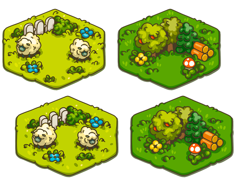
Making changes to art, even if it's already drawn and finished, is normal. The time spent searching teaches you that the need for correction is not a failure. It is a victory of awareness, a leveling-up of your vision and feel for the game's style, and the consistency of the art you draw for it.
On this path, I humbly accepted my mistakes and worked to correct them. Of course, there were moments of despair when a chunk of work representing 4-5 months went into the trash.
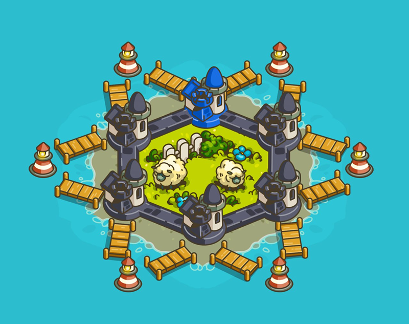
But in the end, we got a visually consistent game with a unique and catchy style. This style, along with the implementation of the mechanics, brought in the first dedicated fans of LandLords. And in May 2025, our “LandLords” won the online “Igroprom” contest in the “Best 2D Graphics” category, which allowed us to participate in the offline “Igroprom” gaming festival that autumn, an event visited by 12,000 people over three days. This event, as expected, took the project to a new level.
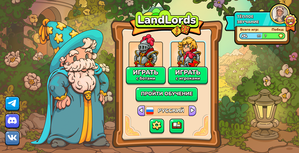
So, don't be afraid to make mistakes, and don't lose heart when things don't turn out the way you want on the first try. Nothing works on the first try, nor should it. How else would you know that you've chosen the right path out of many?
Search, draw, throw things away (as painful as it may be), analyze, and draw again, armed with the knowledge of the mistakes you've made. Remember the wisdom: the road is conquered by the walker. Keep walking, and you will succeed.
