
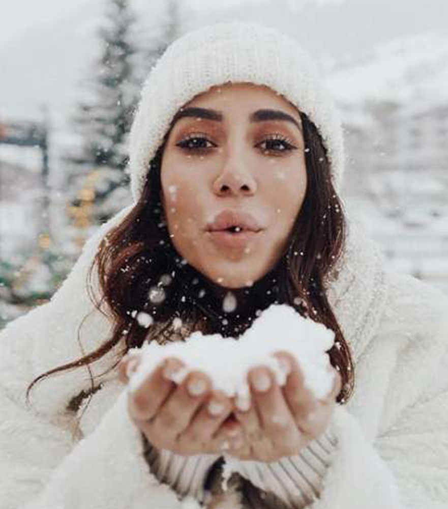
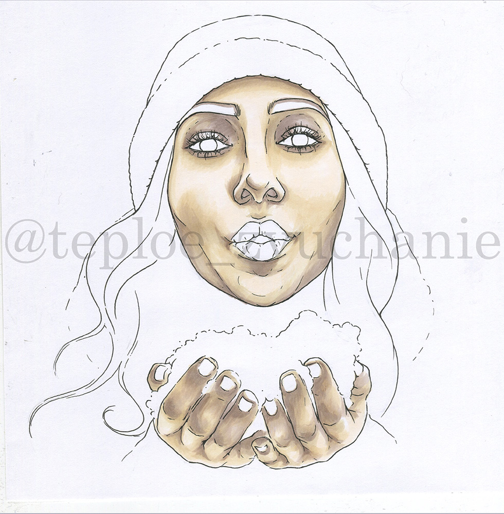
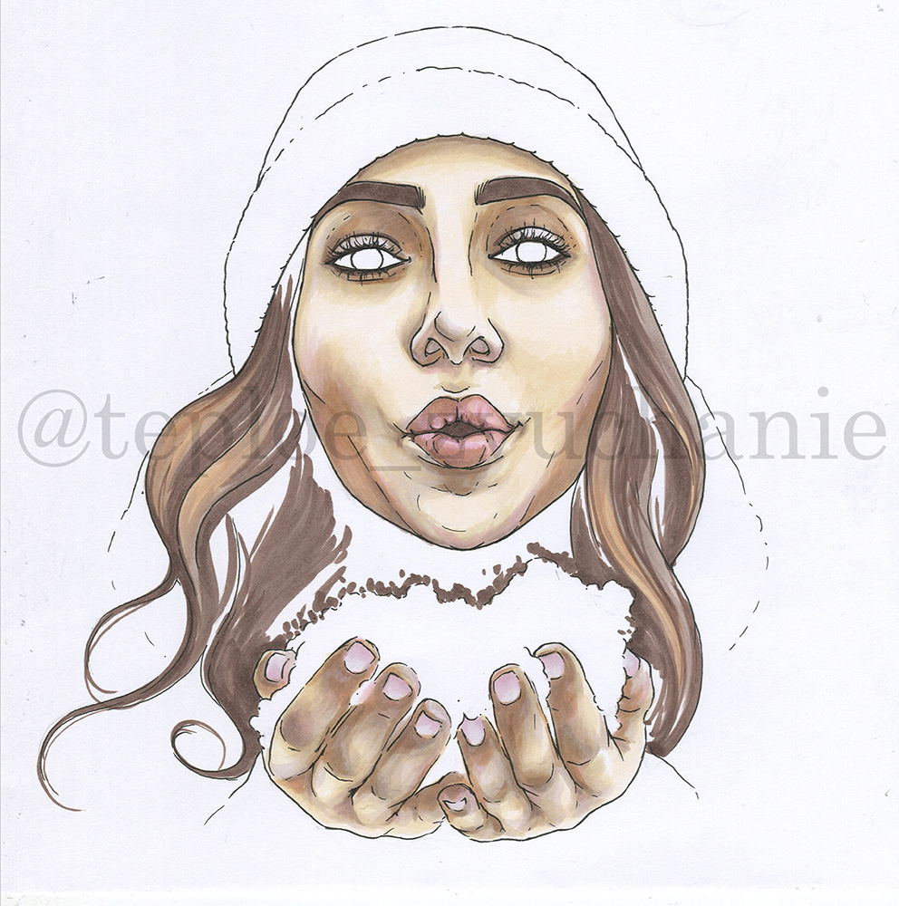
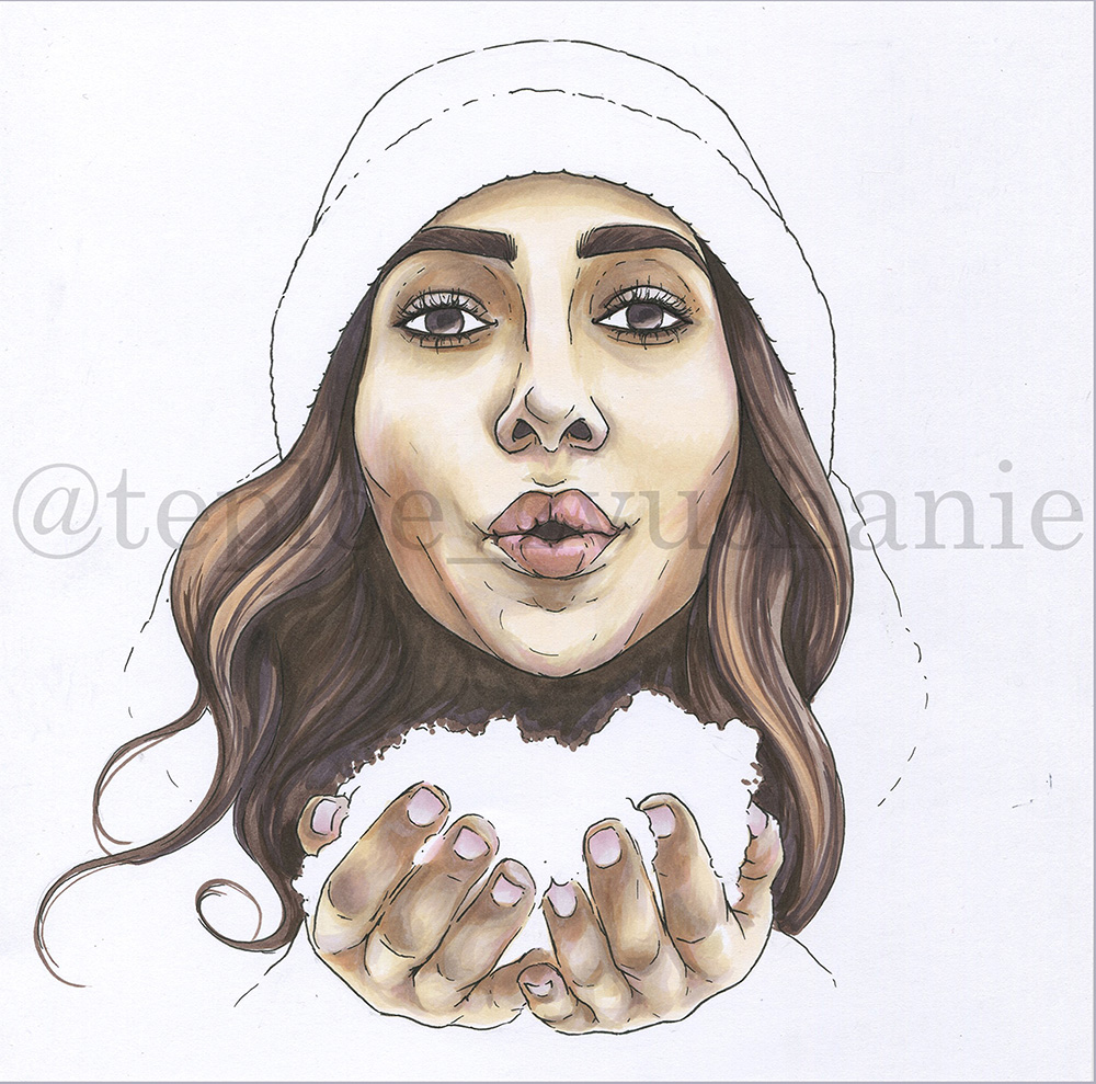
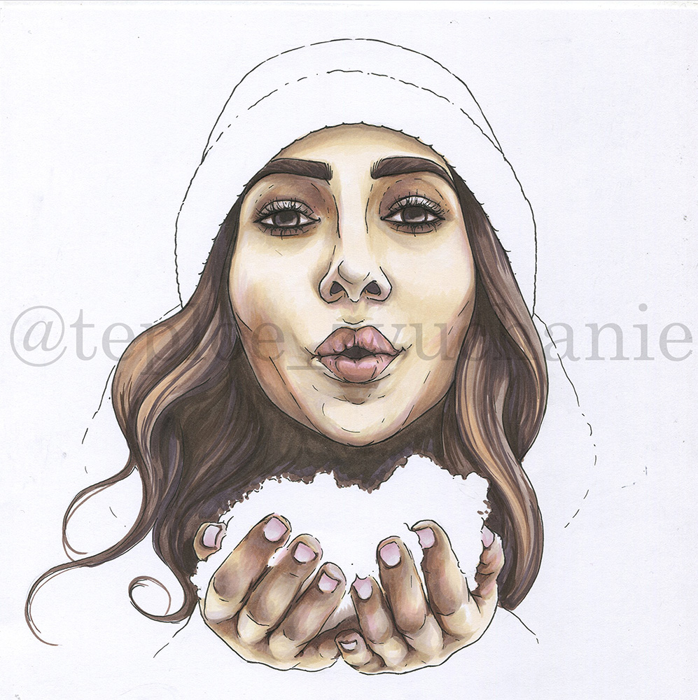
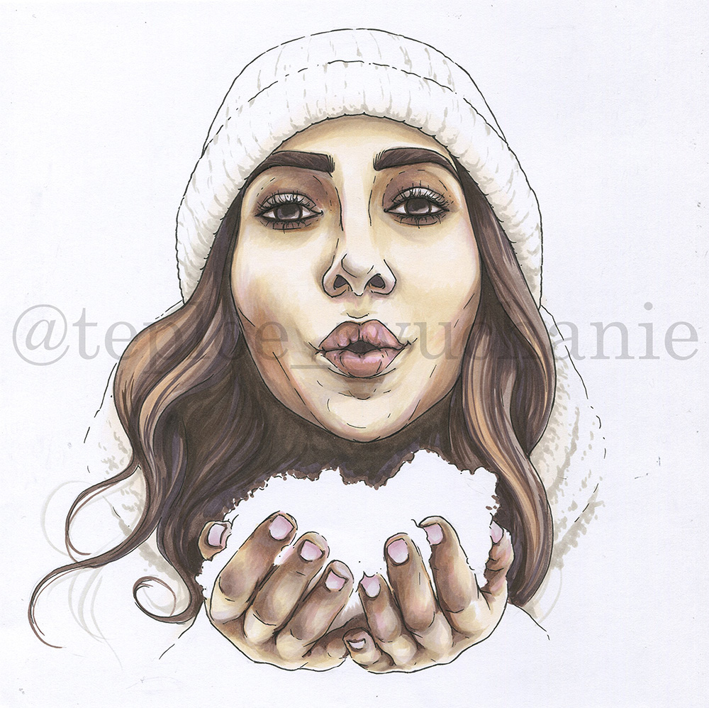
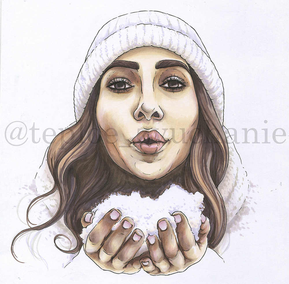
Drawing girl's portrait and snowflakes with markers

Here I introduce the whole palette of colours I used for that work. The given numeration’s for the Copic palette, but at the time there are plenty of analog marker brands which also have that high quality of a products.
When choosing markers pick those with brush nib, cuz its better for smooth gradient transitions and crossings and for drawing in a paint-like technique.
When choosing paper give preferences to more dense types or to special marker types of paper (200 g/m2). For instance I take Hahnemulle SKIZZIE or paper like Bristol of different brands.
Some materials you’ll also need:
- graphite pencil;
- soft eraser;
- white pencil;
- white gel pen;
- white acrylic marker or ink;
- thin black liner 0.1-0.2 proof to alcoholic ink;
- blending marker (optionally).
Building face
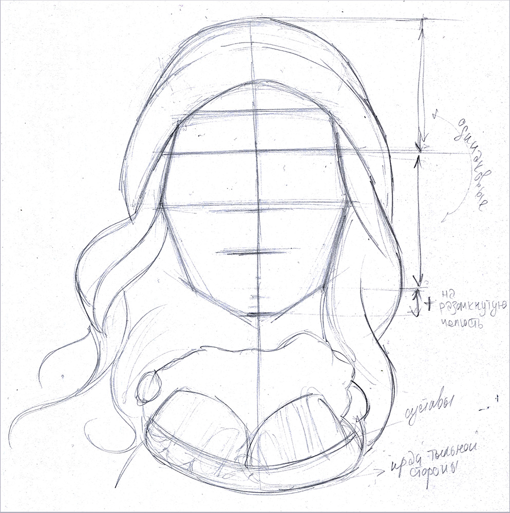
Even if you’re familiar to some of principles of building face, bet there are some things that regularly stay out of your attention)
The standard is: you take the height of the whole head, with the brainpan; ½ from this general height is eyeball (not brows!) line.
Then ½ lower is the nose basement line (the place where nose wings join the face plane)
½ lower from that point is lips line. It runs through the corners of the mouth.
Keep in mind! In a calm, relaxed state human always has his jaws slightly open, so the general height of the face lengthens down. It becomes even more obvious when we do any mimic movements — laugh and smile, make “O” when blow on something.
For our reference the brows line placed ½ higher from eyeballs line to the beanie edge.
About the beanie — don’t forget it also has depth, so gain some more height on top.
When outline hands, take the knuckles line as the lower edge, then draw the same half-circle bit higher — the first phalanxes line. The general height of the hands in this position shouldn’t be more than space between nose line and the chin.
Make soft outlines for hairs — draw it as a general forms, locks. Pay attention to its plasticity: try to “put” locks fit to face, wrap them around each other, under the beanie.
Outline the pile of snow in hands arbitrarily.
Building face features
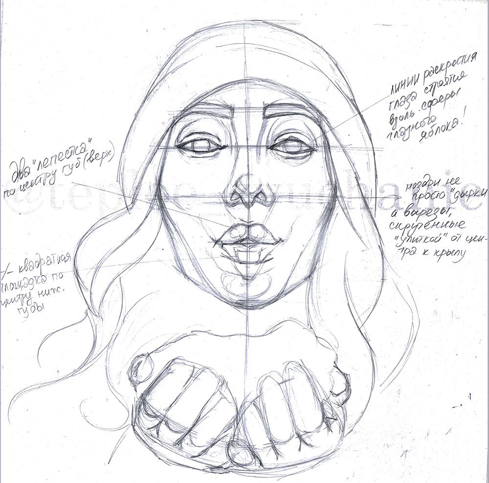
Here are some tips to build most realistic facial features:
The eyeball itself is bigger than an eye. When we say there is an eye length between two eyes, actually we mean not eyes but eyeballs. Gain a half of an eyeball length to the both sides from the eyeballs — for the temples.
Each part of the face has its plasticity. So an eye is an incision on the flesh. Build eyelids along the eyeball, wrapping them around, and keep in mind they have depth too. Outline not only the obvious fold of an upper eyelid, but also a smoother lower one.
Same can be said about nose plasticity: start with pointing the nose tip. Depending on position and features it can be higher or lower the nose basement line.
Nostrils are also incisions on the flesh. Pay attention to how the lines wrap each other, don’t just draw a round holes. Usually nostril starts from the nasal septum, smoothly wraps the nose wing and then comes back to septum hiding behind it. Don’t forget to draw the nose wing depth.
According to our reference lips here are built with two petals of upper lip and one trapeze of lower. These shapes are most convex, and connected then with lip corners. Also draw plasticity of the lip closing line, don’t make it just straight.
Point the fold of a lower lip: it is bit deeper than the pink part of a lip. Draw little folds at the lip corners.
Split up the hands to fingers according to reference. Draw two halfcircle counter lines where the fingers basement get close to each other.
And most important — please don’t stick to the rules of building too much) It shouldn’t be very perfect. All the faces are different cuz they don’t fit these standards that strictly. Lean on reference while drawing and analyse it too)
Linework
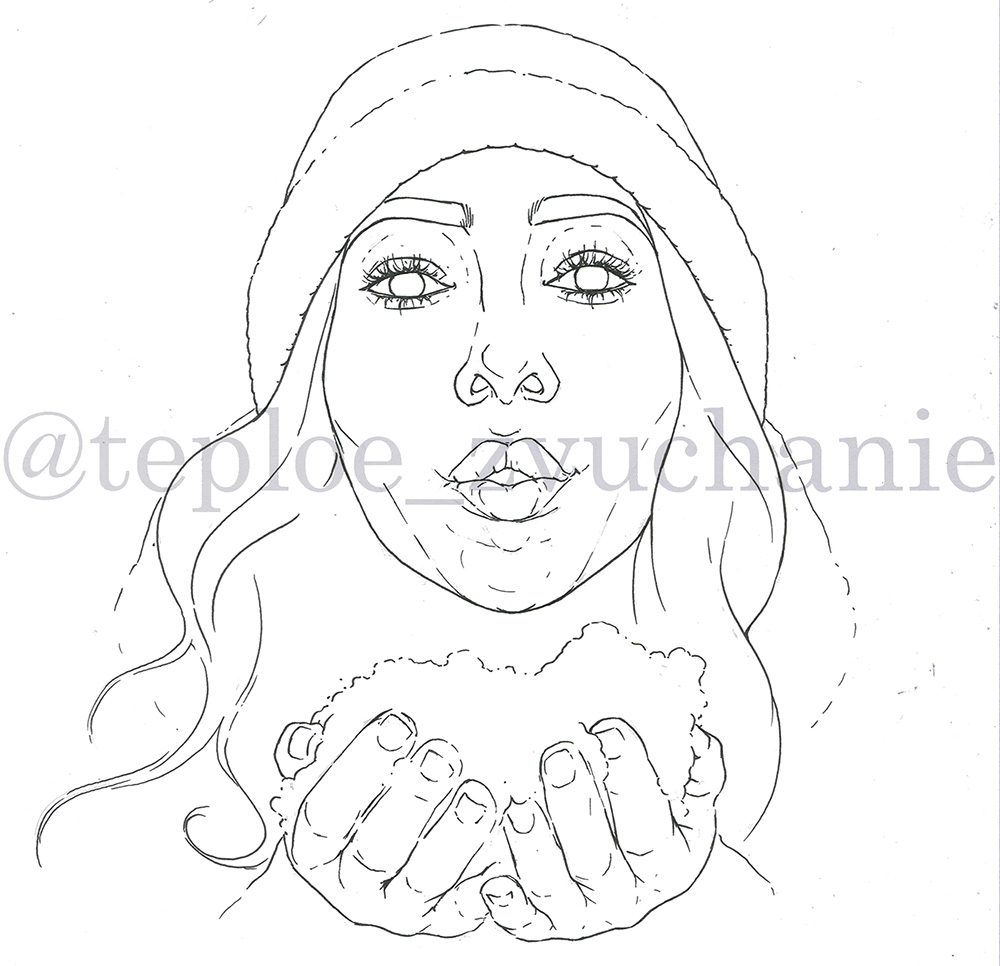
Take any liner which is proof to alcoholic ink and won’t blur under it (I use MICRONS by Sakura , but there are plenty of other brands such as Copic or Touch for instance). Use thinner one — 0.1 or 0.2 will be great.
Start to line your sketch but don’t erase pencil for now:
- Outlines of rather monolithic, solid shapes draw with continuous lines. Like face outline, locks of hair, brows.
- Outlines of textured things or compound shapes draw more raised and sophisticated. Such shapes are beanie, plastic shapes of eyes, nose and lips, fingers.
- At least there are sketchy outlines, intermittent. Use it for a nose bridge, obvious silhouettes of upper edge of upper eyelids, brocken outline of snow, some mimic lines, nose tip.
Don’t you draw the lashes straight! They are an arcs placed in a shape of a fan. Sometimes to make it more lively draw 1—2 arcs in a contour direction in a row of same directed arcs.
After all the lifework will be done erase the pencil sketch.
Coloring: step 1
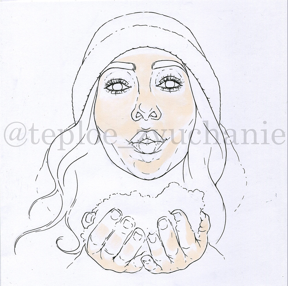
Most of my attention I will pay to this part. Each step here I will give you a pic and description of which color to apply, where and how.
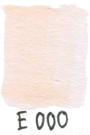
So let’s start with the most lighted areas of the face using the lightest shade of peach from your palette.
In my case it is Copic E000
According to reference apply it on a T-zone, nose tip, chin, cheekbones and stretched parts of an upper lip.
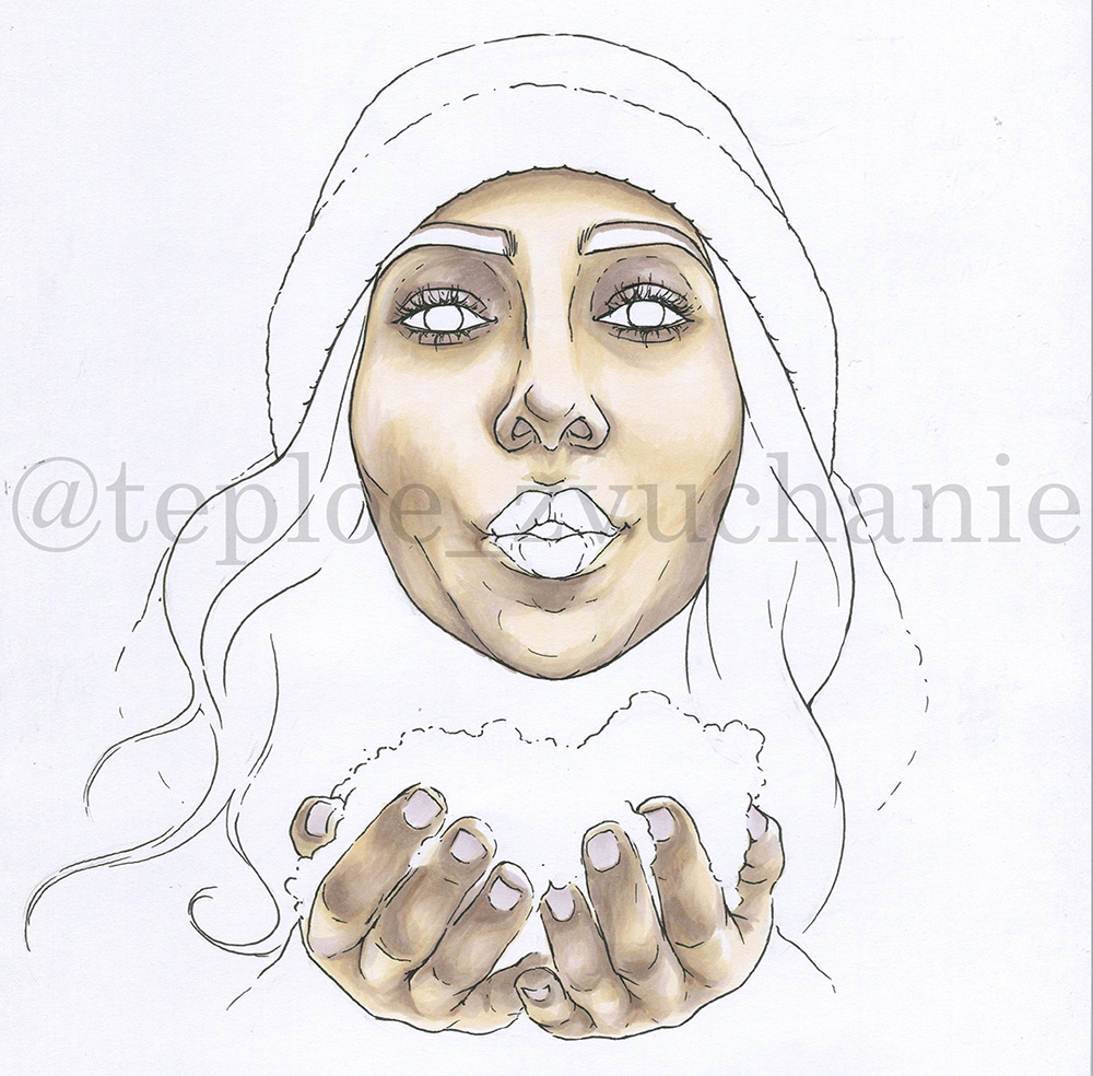
Coloring: step 2
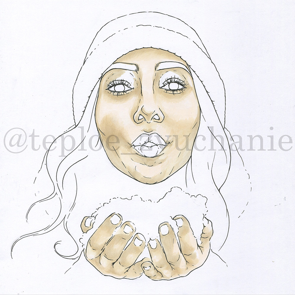
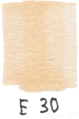
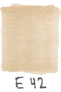
Gain more tone with quite darker but still light enough shades: better to use different in color tone shades, like, take a bit deeper shade of peach and another one more of a beige. I use Copics E30 and E42.
Point with them the general depths, where you will gain more tone lately, and also transition areas, along the beanie edge and the face, around and under the eyes, along the nose bridge, accent nose tip and wings, put a bit in a nasolabial fold and pit over the upper lip, put under the cheekbones and lower lip.
Also run with it through the fingers leaving lighter places on the first phalanxes and nails.
Apply soft touch, with taking off at the end of a stroke, dissolving. ( From here on — soft stroke). To make the transition between colours more smooth blend it with the lighter marker (in our case Copic E000).
Coloring: step 3
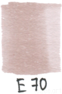
Include new color tones in your work — warm greyish violets, some call them “mushroom”, some “champagne” or “dusty rose”. In Copic palette it is E70 and E71.
Accent more the shadow areas with them, applying over: along the edge of the beanie, nose tip and wings under, also some adjacent space on sides, under the nose and septum area a bit; along the lower part of face and under the cheekbones; under the lower lip and at the lip corners. Fingers: give some extra attention to the joints and nail beds, finger closing lines and counter folds at the basement.
Also cover with it the upper eyelid areas, leaving its movable parts light, gaining some more tone to corners. Apply it under the lower eyelids and along the brows.
Use soft stroke: blend it with lighter marker shades — E000, E30 (especially over the lower part of the face); on the fingers and eyelids use lighter E70.
Coloring: step 4
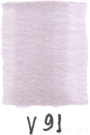
Next step add some light greyish-lilac shades. With it you will make the whole art more picturesque and gain the sense of cold light over the transition areas. I use V91 in Copic palette.
Apply it over the light areas of upper eyelids, work on the shadow border over the nose, lighter areas around the eye sockets, along the cheekbones, and to combine chin with lower lip. Use it also through the shadow borders on fingers and for nails.
Gain more general tone with E30 — go down with it from the lower eyelids to cheeks, apply over nasolabial folds and lower part of the face. Also use it to generalise tone along the nose bridge and forehead.
Use soft stroke where you can apply it from the darker border or line (to say, from the edge of the face to its center, from lower eyelids down to cheeks and so on). Where you have no linear edges use “retouch hatch” — thin and finely hatch with very tip of a brush which further you blend over with lighter marker. Take E000 for blending.
Coloring: step 5
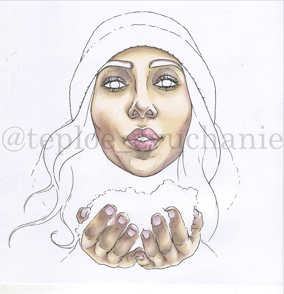
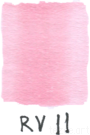
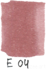
Now add some pink! Both cool and warm shades, two will be enough. One is more vibrant mid pink and another one more brick-shade rose both mid light. I use RV11 and E04 of Copics.
First of all process lips: fill the whole shape with one light layer of RV11. In darker areas (according to reference the lest part of upper lip and the volume of the lower one) use E04. To smoothen the upper borders and to gain mid tones use another one layer of RV11.
Add RV11 to cheeks — under the cheekbones and to the both sides of them, to the mimic lines connected with chin. It is essential to add it in the nose — tip, wings and under. Shade with it nails from upper edge down, and fingers themselves — fingertips, nail beds, a bit in folds.
Work fairly with soft strokes.
Coloring: step 6
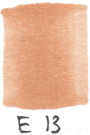
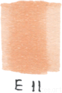
Then I take two shades looking close in color tone but one bit lighter and one bit darker, both warm pinky-caramel. In Copic palette that’s E11 and E13, first lighter, second darker.
Bring lively colours in shadow areas with them: eyelids (leave only light spots on movable parts), under the brows, slightly on nose wings and around septum, lip corners and below lower lip, along the lower jaw corner.
Also add some warmth to finger, layering on the same shadow areas — folds, joints, between fingers.
Gain some tone on shadow borders of lips and very slight along the beanie edge.
According to reference spot some most lightened locks of hair. Use soft stroke and one of the colours or both at once as appropriate.
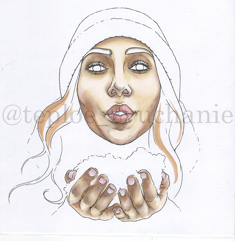
Coloring: step 7
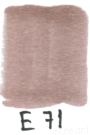
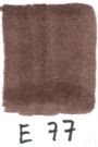
It’s time now to bring in some mid-dark tones. I pick some from already familiar group of violetish-browns, this time E71 and E77.
E77 is darker. Use it to fill in the brow shapes, lay some shadows in eyelids folds and outline the eyes. Fill in the gap between opened lips and don’t forget to slightly point some wrinkles on lips and lip corners. Draw general volume of hair locks and dotted outline above the snow pile.
Use E71 to blend and smoothen places of applying E77 (if needed). Also make a crossing from lighter spots on hair locks (you’ve made it previously) to the darker areas. If needed gain some contrast under the lower lip and over the fingers.
Draw dotted line with separate short strokes, hairs — with simple stroke of full pressure. Do blending with soft strokes.
Coloring: step 8
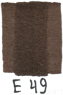
Now you’re bringing in one of the two most contrast, darkest colours — extra dark close to black warm brown. I use E49.
But firstly lets spot the lower parts of eye irises with E71 — its a lil reflex there.
Now take E49 and start with filling in the shapes: put one layer over nostrils and opened mouth, all over the neck area — gap between chin/jaw and the handful of snow. Also run with it through the general shadowed areas of hair locks — where they wrap each other, laying close to the face or go under the beanie.
With one layer fill the upper 2/3 of irisis to the border of E71. Smoothen the border with E71. Add some thin strokes to eyes outline.
Then working with thin lines add some texture to brows (from lower border and up) and hairs — draw some separate lines over the lighter places BUT not evenly.
Coloring: step 9
Next step take E77 and E71 again.
Process shadows and contrasts over fingers with it: use darker marker to point folds between fingers and at the basement and around the nail beds, then smoothen them with E71.
According to reference gain some tone over the whole image in the necessary places or generalise areas with the help of colours you’ve already used:
- E30, E42 — for generalising facial tone:
- E11, E13 — in a darker places, on fingers, eyelids, cheekbones:
- RV11 — along cheeks and over the phalanxes:
- E71 — in shadows and volumes over the lips, depths of the upper and lower eyelids.
- E70 — along the upper eyelids BUT from the inner side of eye, the eye itself )) Also at the inner corners of eyes. Plus put it a bit on the snow where it comes close to fingers.
Coloring: step 10
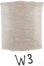
Now you come to clothes and environment. Pick up light warm grey but still rather saturated to be discernible. Of Copic palette use W3.
Point basic textures and reliefs on clothes and snow pile:
- shadow along the beanie’s edge (drawing over the beanie itself), with dotted line point knitted texture of the beanie;
- draw some arc lines — this will be shadows from scarf and its folds, gain some more tone along the hair line and places where scarf is supposed to be close to a coat;
- draw with dots light shadows on the lower side of a handful of snow where it’s closer to palms and fingers.
Don’t blend intentionally, work with light smears.
Coloring: step 11
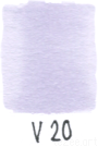
To make shadows look transparent and diffused add in some distinct light shade — extra light violet to say. I use V20.
Lay it over practically the same areas as you did step before, but drop some diversity on strokes, no need to cover exactly the same spots.
Gain some tone over the line in a mid of a beanie. Make a double layer over the shadows in scarf and along the beanie edge, mark deeper knitted textures of the clothes.
Pay special attention to snow pile: draw with dot clusters doughy texture of the snow from palms and up. IMPORTANT: don’t make these clusters even. Run through the upper border of a snow pile.
Coloring: step 12
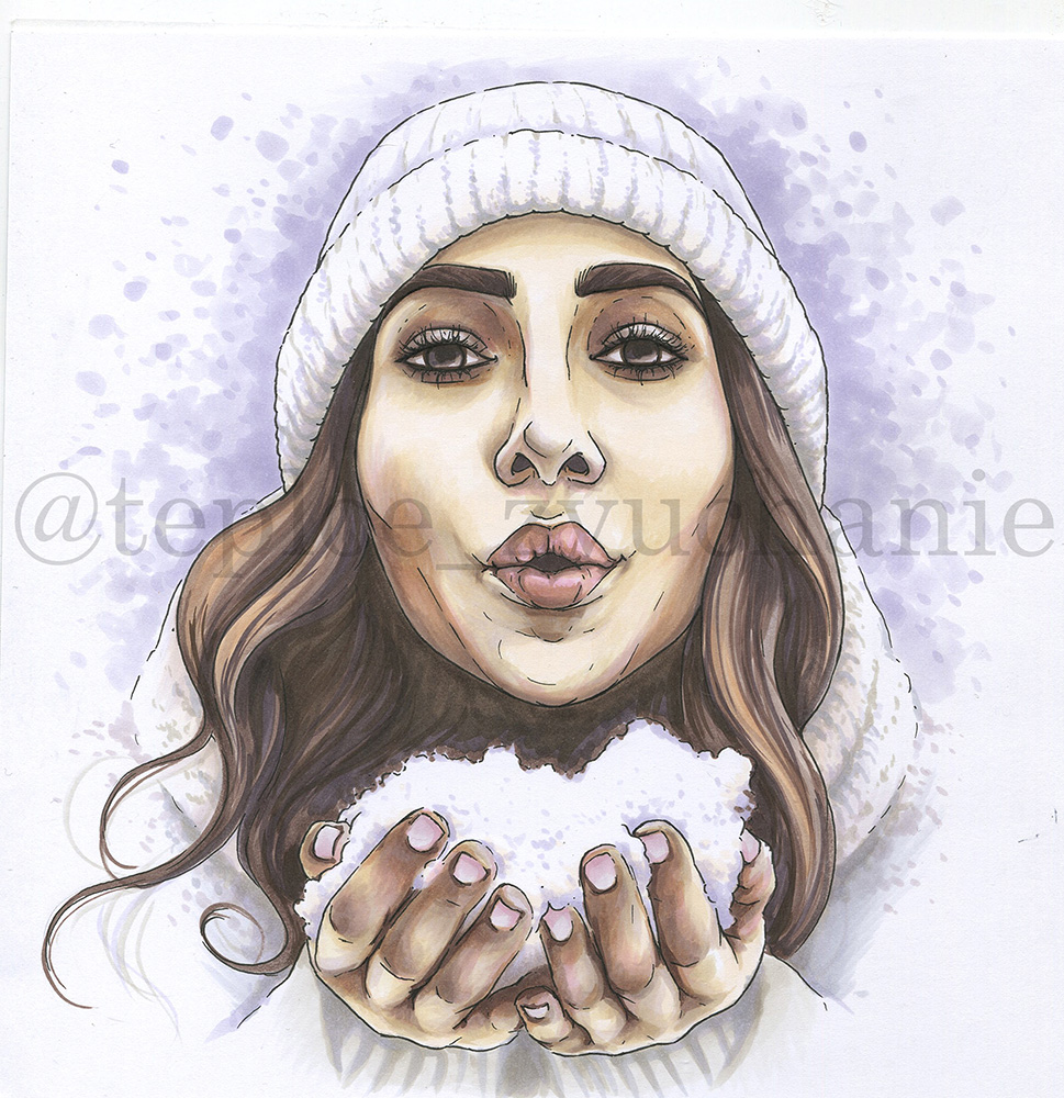
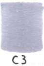
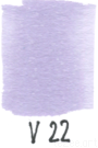
You’ve got close to the finish line: for bringing the art together you should make some background. Take a grey shade close to that you’ve used in previous step but cold, and bit more saturated shade of light violet. In Copic palette that’s C3 and V22. Also you need colours from previous steps too.
With circular movements put spots around girl’s silhouette; make it chaotically, but in that way path all along until the outline won't be filled. Start with the lightest — V20, then V22 and C3. Create an effect of dissolving to sides violet “snow”.
An area between roughly edge of scarf to cuffs make deeper with C3 , V20 and W3. Use same markers to loosely draw texture of cuffs and shadows below the hands.
Gain more shadow and relief to the snow pile, the scarf and the beanie, paying more attention to folds and lapels with the same colours.
Work with circular spots full pressed (background), dotted smears (texture and shadows), soft strokes (shadows between scarf-cuffs and below hands).
Coloring details
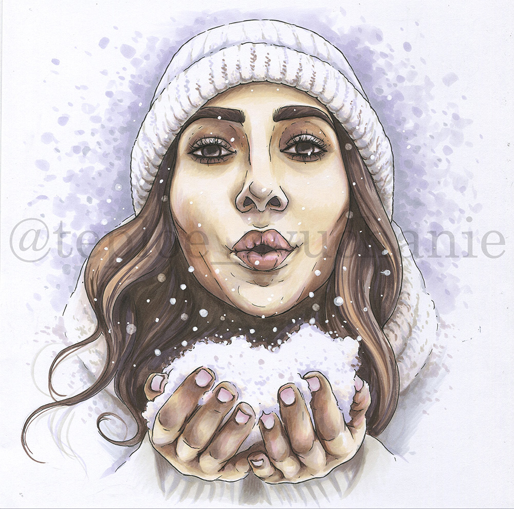
Now there are only detalization and refining left!
Take white opaque materials: white pencil, gel pen, white acrylic marker or ink. Also the colourless blending marker will be useful (it can be replaced with any very light, close to transparent marker).
But first add all needed contrasts where there’s lack of it — be guided with reference. Draw more thick lashes with black liner and drop black pupil closer to the upper eyelid. Add shadows and textures to beanie knitting and scarf with E77 — work subtly. Add some E71 in folds. If needed emphasise the darkest folds between fingers with E77.
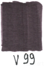
Also you can gain some lil more tone between hair locks and over the neck with new one blackish lilac V99.
Draw with blending marker (or the lightest one of all) some chaotic spots, full pressing it with circular movements like if you want to wash the previous colour out. Better draw it on a more toned, darker areas. So they look like blurred snowflakes.
Now randomly — but not evenly — apply snowflakes right over the art with your white materials: make them with dots and more noticeable spots. Make the concentration of them more thick closer to the snow pile.
CONGRATS! THE PORTRAIT IS FINISHED!