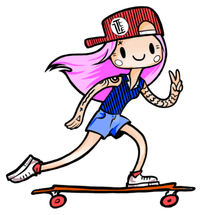
AmRest mascot stickers for KFC
Each particular project, no matter if it's a mascot for a huge catering corporation or a char for an online mini-game, has its own unique spirit, which I have to provide in a best way possible through the character as an artist.
The idea of descripting this case came up after small talk with my friend. She said — “Oh I haven’t even know that it was YOU who did stickers and design for KFC!”. That time I got that something really mundane in my eyes may come as a real cool thing for someone else.
Yes, I did those brand stickers for KFC restaurants. I have a friend managing STIVOS design studio and they got a contract with AmRest Group that holding KFC and Pizza Hut restaurants. So this friend came to me in 2019 with the task: AmRest needed some mascot character for corporative culture. Further it turned out they need two.
Sourсe of an Idea
Before I got the task I’ve been drawing a little self-challenge which I’ve called #tzee_summerthanksgiving. I’ve invented it just for my own pleasure. The point was to draw a small comic-like picture where I used to name one most memorable and enjoyable thing happened that day. It should has been drawn daily. The main character was a slightly crooked girl, kinda my avatar and one of her passions was skateboarding. So this exact freaky girl my friend and AmRest reps chose as the most appropriate prototype in terms of a company’s spirit.
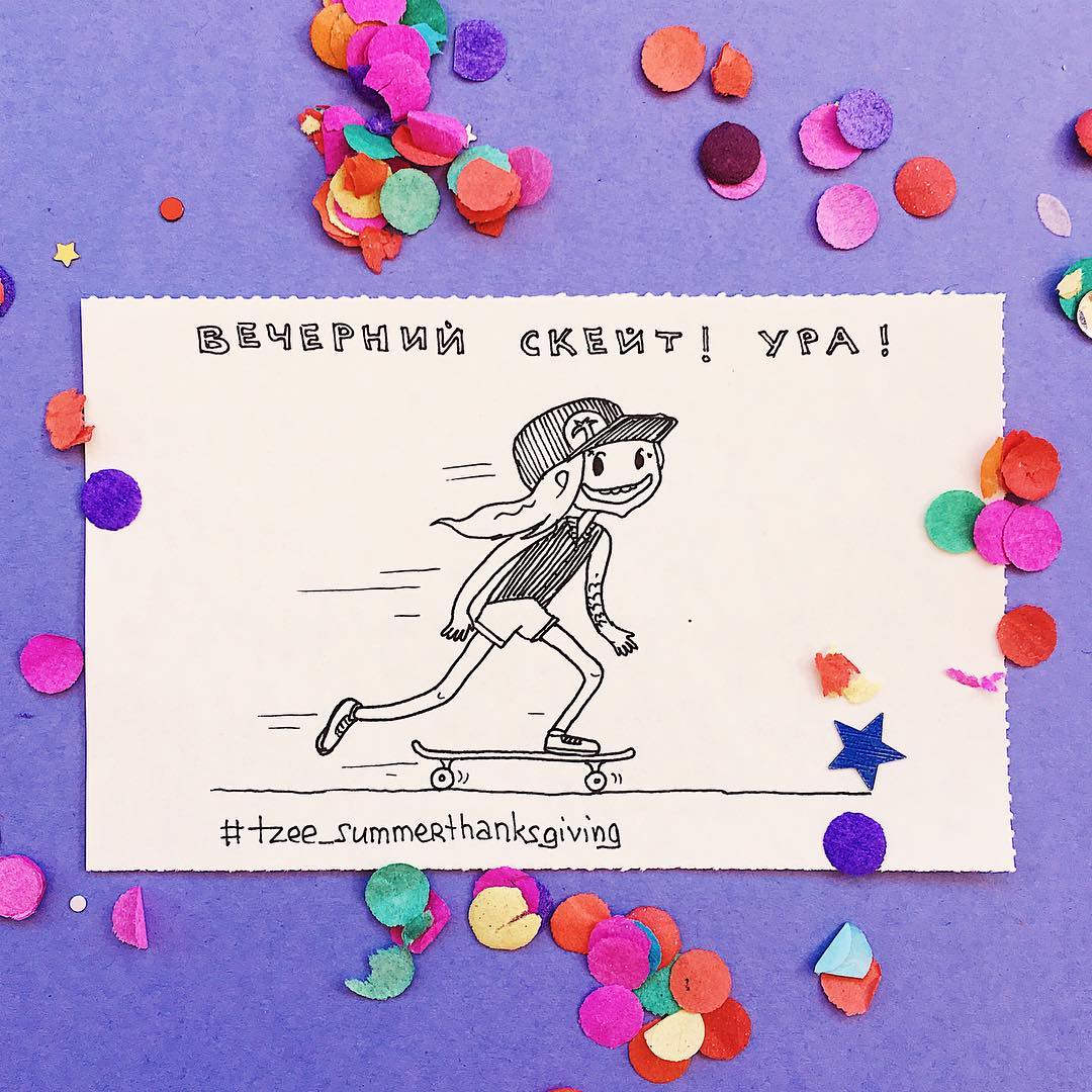
We’ve got a big meet up where we figured out the final conception of a character. But for a moment I had been already using this girl in my social networks and it should has been slightly “brushed” for my client’s needs and image. Also it came clear that we need a pair for her: characters were meant to be used in corporative culture first of all, so they had to embody employees of both genders.
Development of an Idea
After meet up I runned the researching process of a proper look of characters. Firstly I decided to step from the original prototype style: stick-like arms and legs, punkish cap and “converses”, minimal sex characteristics. But once I set on drawing a boy, it became obvious they need more differences, otherwise they looked as a couple of monkeys dressed up in different suits.
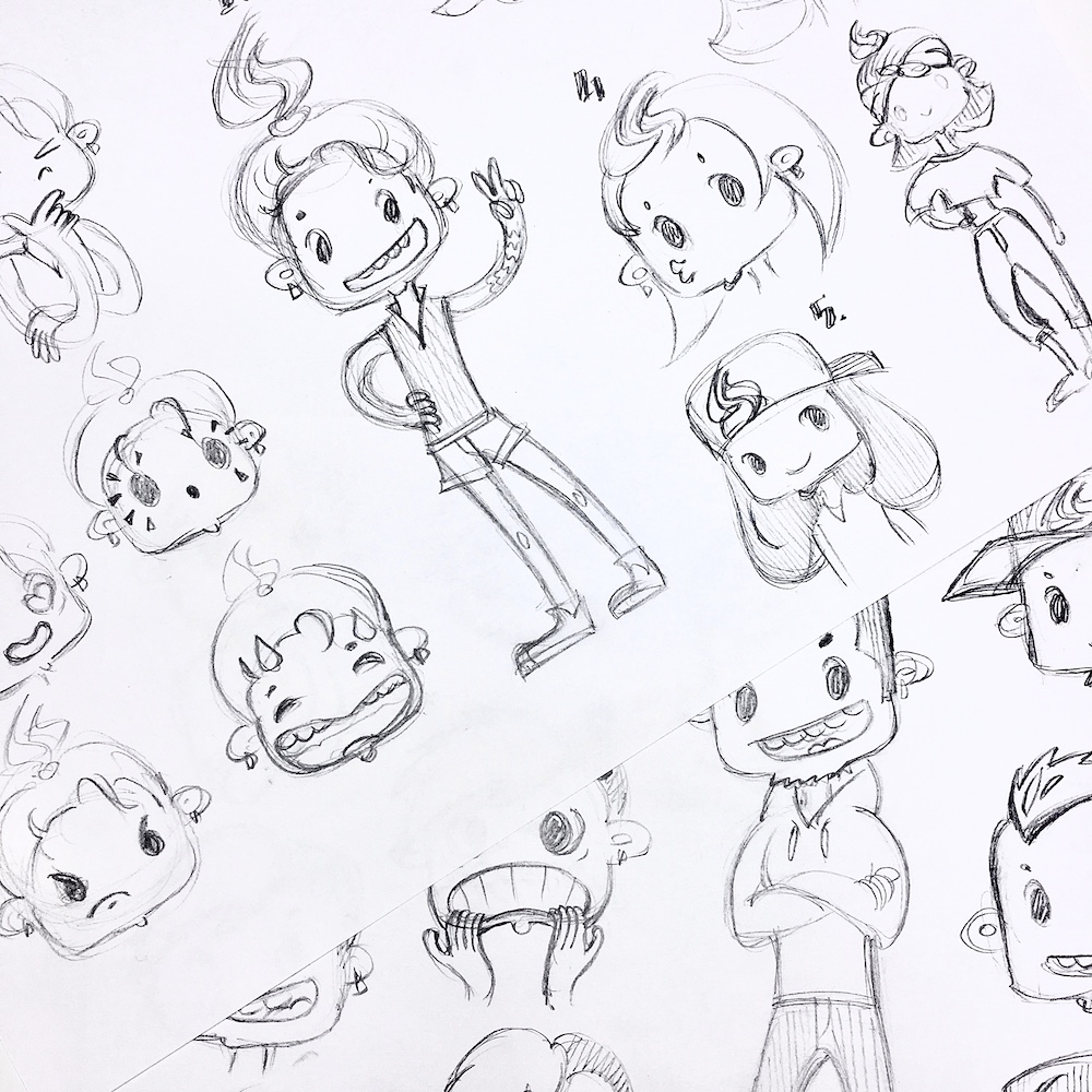
Also appearance in this style looked really too cartoonish and bully same time. Too stylised. Crooked teeth, side-set comma-like eyes, gestures — they were too comic and punk like heroes of some teenage series from 2✕2 channel, like pop variation of Beavis and Butt-Head 😅
So we decided to bring more femininity in a girl’s look: replaced cap with a soft hipster bandana, that from under it hairs and bun should be visible. Brought more body shapes but unobtrusively — by the wide banana-trousers and crop top. These two garments shape the silhouette of sandglass in the best way also allow not to use these beaten hacks such as pointing big breasts or big butt.
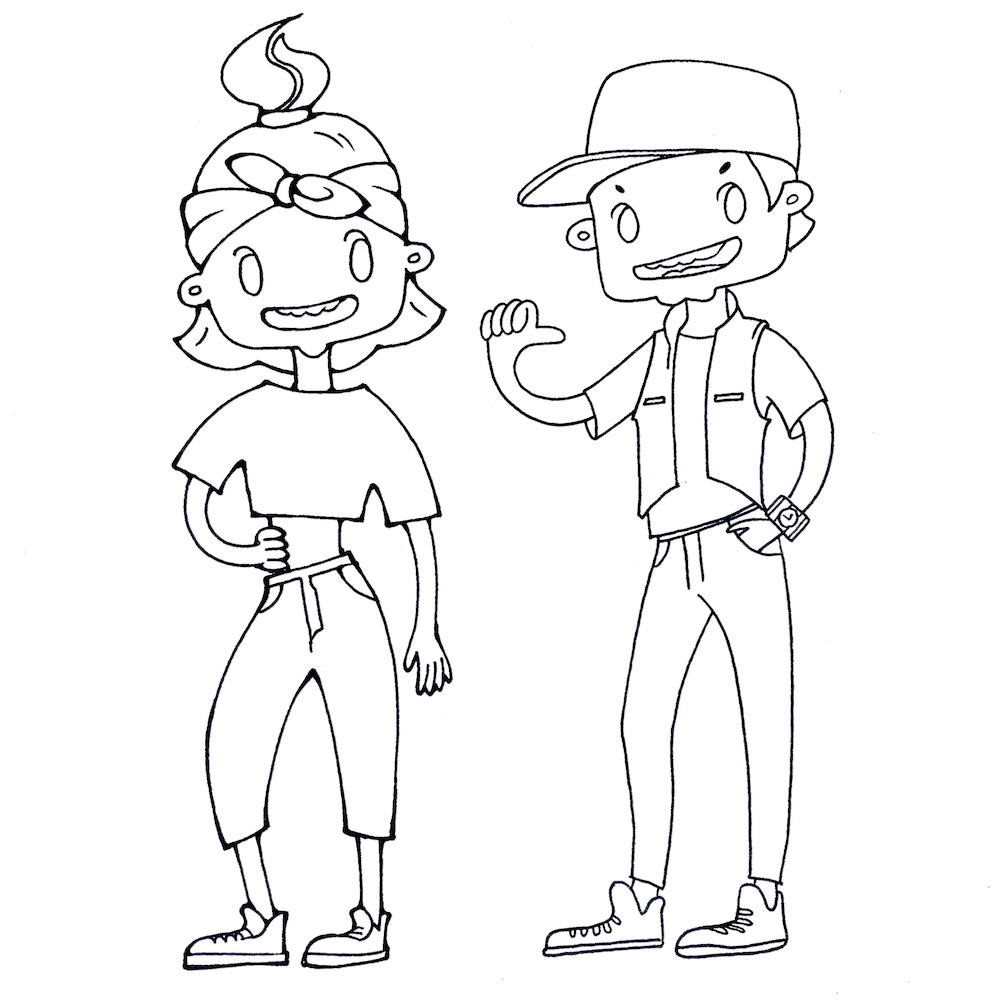
Boy also had been ennobled to more physically fitted and also mostly with the help of the clothes. I put a cap with peak headed front, gave up on any beard as a visual sign of belonging to a certain group. By the way we refused to use any piercing, earrings, tattoos, though it seemed to be good trendy idea on the start. The jeans gave our boy a clerk look no matter how I had tried to put it on him, especially obvious in comparison with a girl. So it was decided to put joggers on him. The vest over the top: it also highlights triangular masculine shape with no placing accents on a huge biceps for instance. We dressed both of them in sneakers. They gave better informal and even sporty look in addition with girl’s bandana and boy’s joggers.
Face is still looking unrealistic until it has no nose.
But after all polishing — such as completing boy’s look with hand watches and smoothening lines — there was still something absent. Made a try to bring more life to characters — more stroke, volume, more details in drawing lines and its differentiation, but it still didn’t help the right way. Though chars became nearly as good as they expected to be. Finally I got it: I can put any amount of life in it but face is still looking unrealistic until it has no nose.
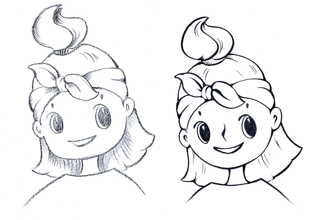
So with the final step our characters “grew up” their noses! And need to say that even a single line anime-style nose had got at least three variations. After “the best nose” contest was closed there ware only polishing chores left: which belt should be on a trousers? Belt or rope ties on joggers? Rib stitch on collar? The vest is puff or simple?..
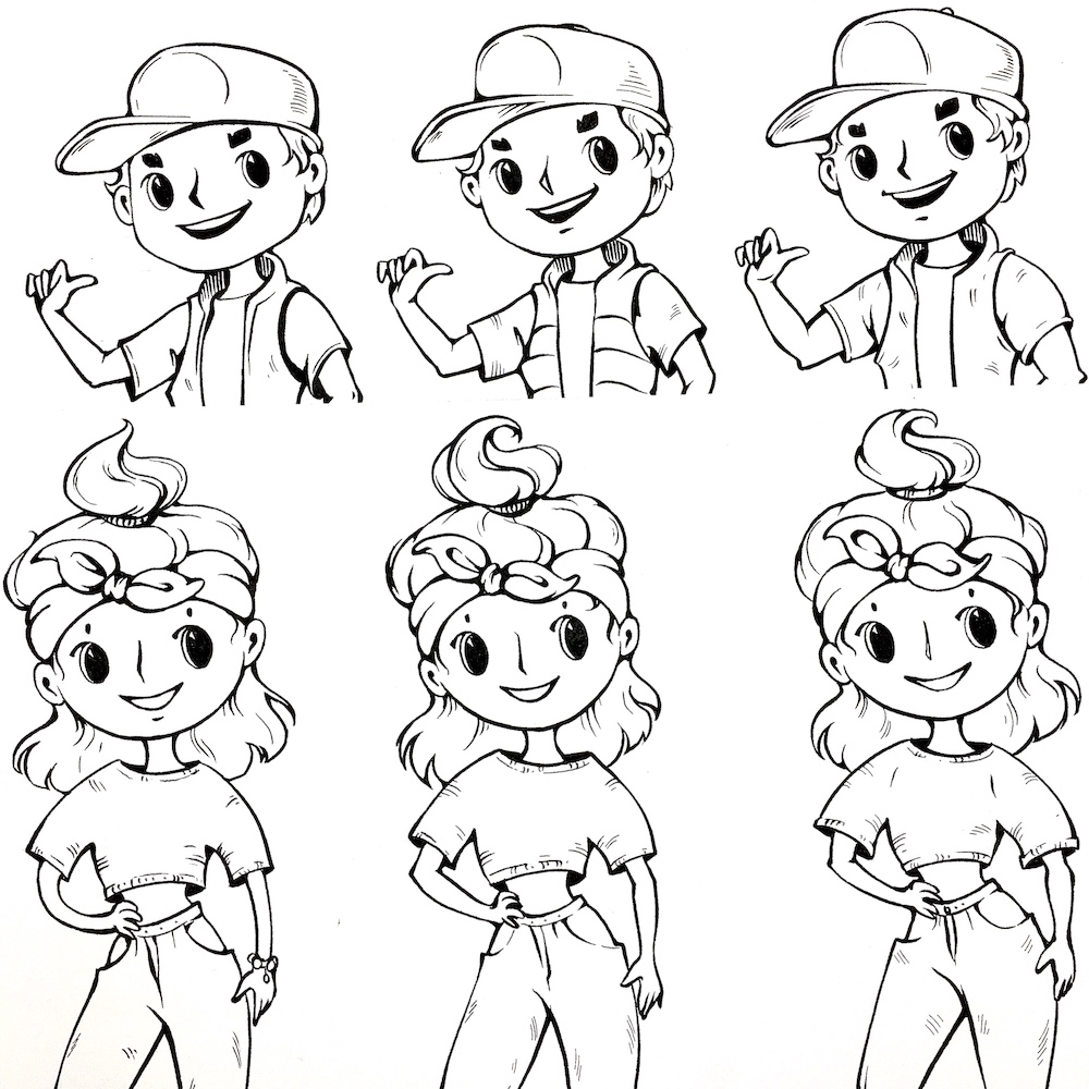
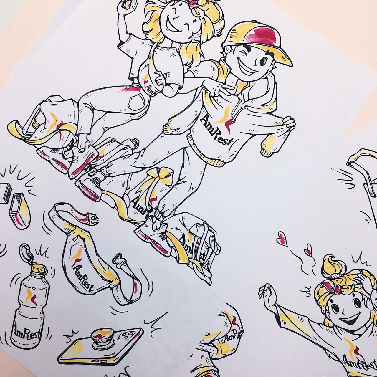
Early we got that we won’t have much colors — only small accents of two corporative colors, burgundy and egg yolk yellow, other things should be drawn just with pure outline. Guys from AmRest wanted to save authenticity and highlight genuine corporative values which they had intent to translate with these characters. That’s why I’ve not only drawn all the characters and scenes traditionally by hand but also put colors with markers in a few sloppy overlapped layers. Eventually we have managed to keep these sense of a live stroke after scanning.
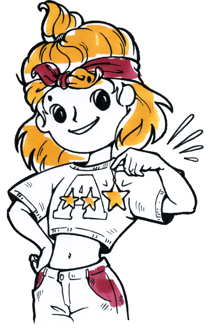
What we got
Almost instantly we did a sticker pack series vast majority of which interpreted the classic emoji’s kit but with a slight drop of corporative specialities. Later they have been completed with both — other objects such as KFC wings basket, corporative gifts, seasonal elements like Christmas balls and gingerbread men and various scenes and stickers which company then used to decorate their order self-service terminals in restaurants, their posters and adds. From latest upgrade: company has implemented sticker pack revealing teambilding, unique corporative events such as contest of talents, video game matches, participating in charity programs, gags which typical for exact corporative culture of AmRest.
Company has implemented sticker pack revealing teambilding, unique corporative events such as contest of talents, video game matches, participating in charity programs
So the story is. At the moment it is an official corporative stickarpack of AmRest company, called “AmRest is cool” and available to uploading on your Telegram with this link t.me/addstickers/AmrestIsCool. Now the collection contains more than 40 stickers and the company updates it and adds new occasionally.
I love to create characters
I love so much this stage of collaborative development of a character. This process always put you in some restrictions but despite it could be irritating from time to time usually I can take a retrospective look on the work accomplished with the well-deserved feeling of satisfaction.
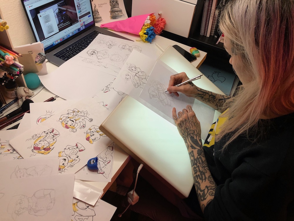
Each particular project, no matter if it's a mascot for a huge catering corporation or a char for an online mini-game, has its own unique spirit, which I have to provide in a best way possible through the character as an artist. Whole lotta things impact the final result — from choice of materials for drawing, CG effects, postproduction, to all the things translating much more of a core values — features of lines, nonverbal gestures and poses, facial expressions and so on. Okay, this process will have both highs and lows but it always will be a breathtaking and exciting challenge for me. Especially if my client feels the same about his project.
If you have a task ahead of creating a character no matter how big is a project, I will be pleased to help you with inventing and bringing to life exact creature. Just mail me hello@tezee.art
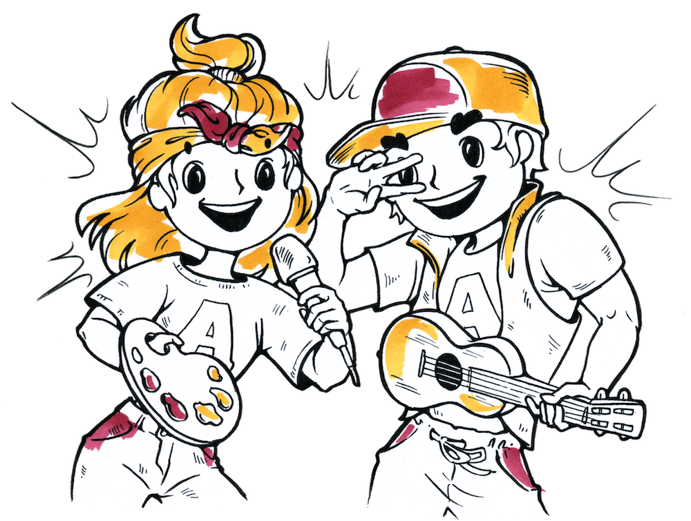
P.S.: by the way my own original mascot character, the brand avatar I use today all over my social networks was created right from the same crooked punky girl.
