
How Paletta was created


Hey guys! I’m gonna tell you in this article about our project, Paletta — it’s a tool to convert alcoholic markers colors between different brands, and it is as helpful for amateur and professional artists as for art-teachers and art shops crew. Based only on pure enthusiasm, we have invested a lot of effort and energy into this project. We are me and my boyfriend. While developing it we’ve learned much about color theory and discover some insider info about alcoholic markers market. The tool is absolutely free, from artists to artists. It started with a simple question…
TL;DR This is the most completed comparative chart of alcoholic markers colors, it is constantly updated and contains 1773 colors among brands such as COPIC, SKETCHMARKER, Сонет, Marvy Le Plume, TOUCH, W&N Promarker, FINECOLOUR, BeCreative. It helps compare colors and compile optimal color palettes whatever the brands.
How we came to an idea
I’m an illustrator and artist. Sometimes I hold some drawing workshops and use there alcoholic markers of COPIC brand. At a time there are plenty of marker brands represented on a market. But before COPIC markers were the absolute benchmark (you may know this brand), and even now they still the leaders of industry. Anyway, my workshop (Drawing girl's portrait and snowflakes with markers) is based on them, but I decided to ease the go-through for those who’s gonna draw it and tried to pick up analogs from two of other popular brands. I’ve compared by eye and the result was rather acceptable, I was lucky the palette of needed colors included only 15 colors, which is really few for a portrait. My boyfriend saw it, so being a software engineer he was hooked with a question how to solve the problem of making the process of comparing more automated. I supported the idea immediately cause each artist drawing with markers has this pain — loads of colors, loads of brands, how can it be brought to an average terms? How to pick up exact needed color in any brand? Here’s a list of most common issues:
- One draws with COPIC markers but they’re too expensive and he/she wants to shift to a cheaper brand.
- One draws with some rather popular brand but has bought a workshop based on COPIC and now he/she has to adapt it to palette of the brand he/she uses.
- One teaches and holds workshops but draws with defined brand and needs to adapt the palette for the students.
- One is a manager in an art-shop and has to help customers with choice.
…the variety of issues based on a color picking among different brands. So we’ve gonna be the first ones to release the idea in such a scale, though many thought of it before. Moreover our collective professional competence was more than enough to get it done.
First steps: collecting data
The idea had inspired us a lot. There were no any tools like this one before. The very maximum you could get were static charts performed as JPEG files and containing only couple of brands to compare. But we needed all the colors of all reachable existing brands of markers. From the very start we decided to use natural live samples instead of pantone boxes from sites of manufacturers to decrease potential visible misrepresentation of colors. This meant we had to find markers in any possible ways everywhere from art-shops to private collections. I was lucky to have some professional networking benefits as knowing some owners of art-shops or being partners and working together with some like “Nevskaya Palitra” and in other cases we’re really communicative and friendly guys. 99% of art-shop crew members were happy to cooperate cause they also had a great interest in realisation of our project! Thank you so much friends for allowing us to stay for hours painting out color samples.

I’d like to mention some of those who helped us then — art-shops “Peredvizhnik”, “Chornaya Rechka”, “Vik-Art”, “Malevich”. There we had an opportunity to take samples of most colors of brands COPIC, SKETCHMARKER, BeCreative, Sonet, FINECOLOUR, W&N Promarker and others.
Also have to note that only once we’ve stumbled across moron’s opposition in a late USSR watchdog syndrome style, when I’ve been aggressively claimed for nearly written approval that I had a permission to get to markers… It becomes so obvious that a person got that job only for money but totally unfamiliar to a subject she sells.
Generally it have been getting done far not in a day, and we had our backs ached of hours of standing and painting down, but while being busy with that we’ve revealed the whole number of odd facts about markers and their manufacturers. So we’ve paid attention its useless to navigate by markers cap when looking for a certain color — it is unreliable even within the same manufacturer.

Moreover it’s funny how unsure may be manufacturer choosing between different design of cap — has a number to be written in white or in black? Always test markers right at the shop to avoid disappointment.


I also classify here that unpleasant fact TOUCH markers are always packed in a shops. You can’t test it and not buy then. But if you are surely gonna buy some, most of a managers will meet your needs and open it up for a test.
Another one funny revealing we’ve done while painting out markers of one of the popular low priced brand. Remark — after loading its palette to the tool. It appears that another one low priced brand just took and used not only the same colors but copied even cap names from the first one! The difference is just the copy-paste brand has a palette four times fewer then original one. And yes, that is not a subsidiary of a first one, there are even different lands of a named brands. Who would have thought!..
All the colors of markers we’ve been painted out manually and right on the place tried to paint samples as equal squares: took it in three to four strokes layered on in the middle, and wrote the name right below. Then we had a task ahead to automate the process of comparing so we needed first to scan all these samples, apply color correction and bring each sample to the general view. Each sample had been manually processed — it’s long and boring, routine mechanical labour. After one month we’ve got processed palettes of three major brands and prepare dataset to run the algorithm. Here’s color samples below:
Searching comparison algorithm
While searching the algorithm we were that naive and get average value of color in RGB color space and then percept it as an XYZ position of a point. The less a gap between two points, the more similarity of two colors. The algorithm turned to be too rough, though it provided some results but some of the colors were not even little close to similarity. So we had to jump into the topic deeply and we’ve been lucky someone had invented the solution before: eventually we just took one of the Delta E algorithms which had been developed by CIE (wiki/Color_difference). The Color space CIEXYZ is common for an average human eye, it’s universal and doesn’t depend on environment, whereas RGB space is redesigned for each specific device where the color is displayed. The chosen algorithm solves our problem in the most effective way.
User interface
We designed the user interface (as it seems to us) as user-friendly and simple as possible.

It has a toggle to shift between very similar and similar colors. The very similar colors are colors which are matching the best way. The similar colors are matching as acceptable analogs. We included this functionality cause not all brands have got a large palettes and palettes of different brands are always differ from each other. Some colors are common for any brand palettes and look practically the same in each brand, but there are also unique colors which you can find just in a palette of a certain brand and it will be more difficult to find analogs for them in other brands, sometimes it can be just impossible. That’s how you can use this functionality: you want to buy a specific color in an art-shop, but they haven’t such, so you can switch a toggle to similar and try to find something next in matching, maybe not very similar but still allowable to replace the needed one.
Also there is a quick search functionality, just input some characters in a search box. And surely there’s a table itself which you can switch to a compact view to make it fit to a small screen devices. The UI is designed for mobile devices too so you can use it right at the shop.
Finally Paletta can help you to navigate through its functionalities if needed.
Testing
We’ve run color samples for my drawing workshop (which I’ve said about higher) through Paletta to test it. It turned out vast majority of colors is absolutely matched and some have found even better matching then I’ve previously picked by eye. Generally most of the test comparisons have showed excellent results!
But all the same we’ve found an issue: the problem was in a fluorescent colors comparisons. The case is “floures” are glowing on paper but after scanning this glow effect can’t be saved, they become just a simple colors and trying to get a matching pair among all the colors in Paletta. So we had to “hardcode” it and write down to code that comparison of floures can be only between floures.

Branding
We had the idea of name “Paletta” right from the start. It comes from the humanisation of an English word “palette” as a female name in an Ancient Greek style as if it was a muse and patron of arts. BTW I found out that there were no muses of visual arts in Ancient Greece, all muses patronised the arts of words: poetry, drama so on. That times visual arts were percepted mostly like craft cause the art pieces were created from references, in other words by copying, but poetry, drama and other theatrical things were created with the help of emotions and thin air so they needed divine patrons more, like this.
We took two main directions in a process of creating logo — faced logo (literally the face of Paletta) and logo performed in font characters. The face itself looked too abstract and far from a real tool with insufficient or too excessive emotion on. The idea of a Greek letter firstly seemed to be very perspective, but each time turned out to bee too formal and… faceless. Finally we’ve handled it and synthesised both approaches in a one image: you can see the silhouette of letter “P” there but it mostly set the path of the shape, and of course there’s a face now.

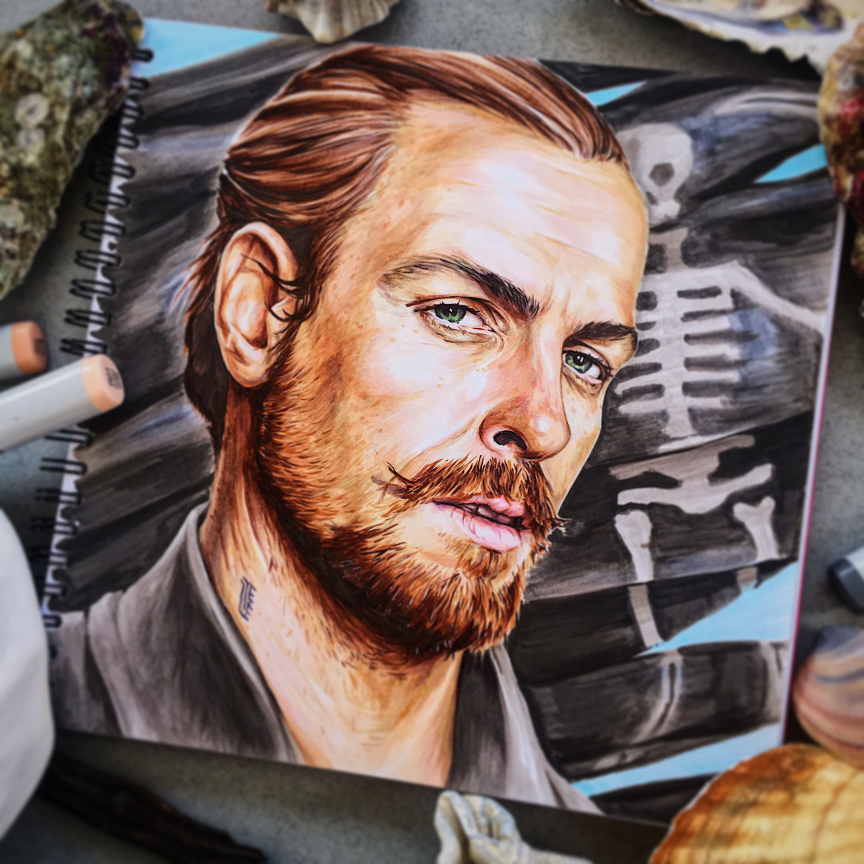
Open but unobtrusive smile — Paletta is your friend and guide which saves time and nerves of a person who try to cope with massive market of alcoholic art markers. And as long as markers go on gain popularity as an art material — they are used to draw realistic portraits and landscapes, fashion illustration, comics and so on — Paletta will help newbies to enter the industry faster and pros to interact with chosen material more effectively. For instance here’s my portrait artwork drawn with markers, the fanart of the “Black Sails” series.
Summary
The current version of Paletta is far not final. We will go on working on similarity, load new brands and palettes, expand the functionality. We are open for your feedback and would be really happy to hear any of your notes and suggestions about our tool as real users of one! Please email hello@tezee.art