Four watercolor brands — four styles
The subject of style has been bothering me for a long time. It can be talked about for hours, including the choice of material. Materials you paint with can affect what you get. Sometimes the specifics will even depend on a particular brand of the same material, such as watercolor. I have four brands of watercolor in my arsenal that I use rather regularly. In fact, I have more, but there is enough experience with these four in particular:
- Nevskaya Palitra (russian: Невская Палитра)
- Pinax
- Van Gogh
- Shinhan PWC
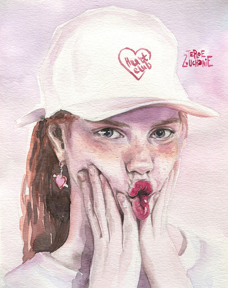
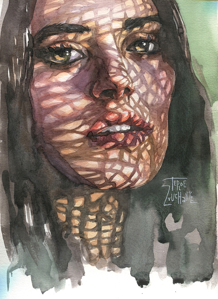
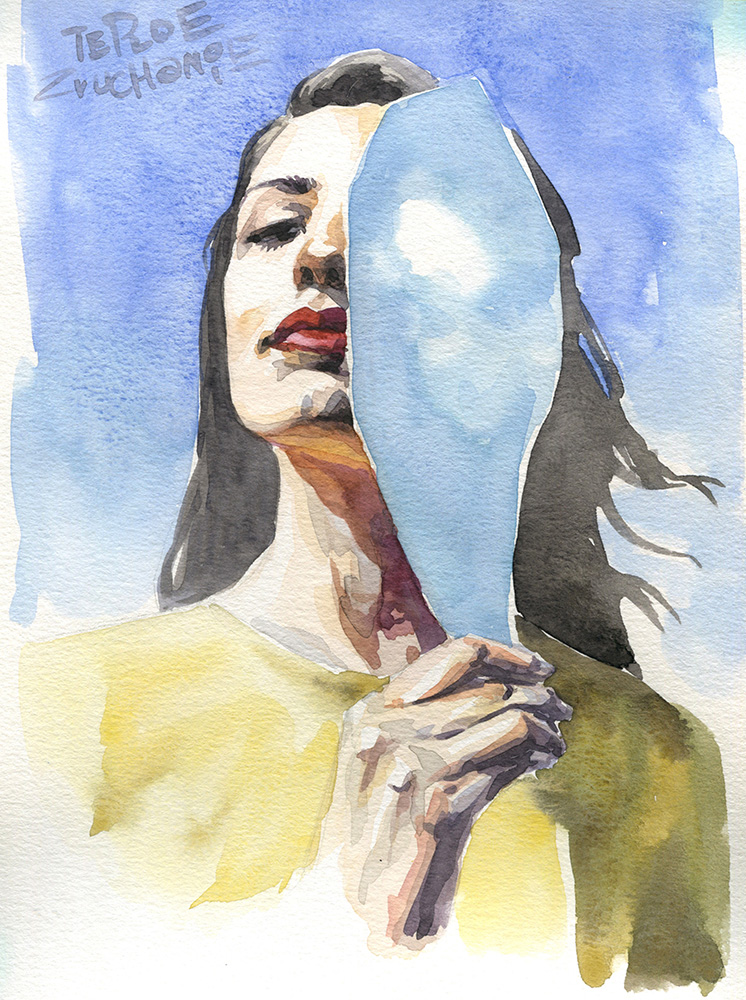
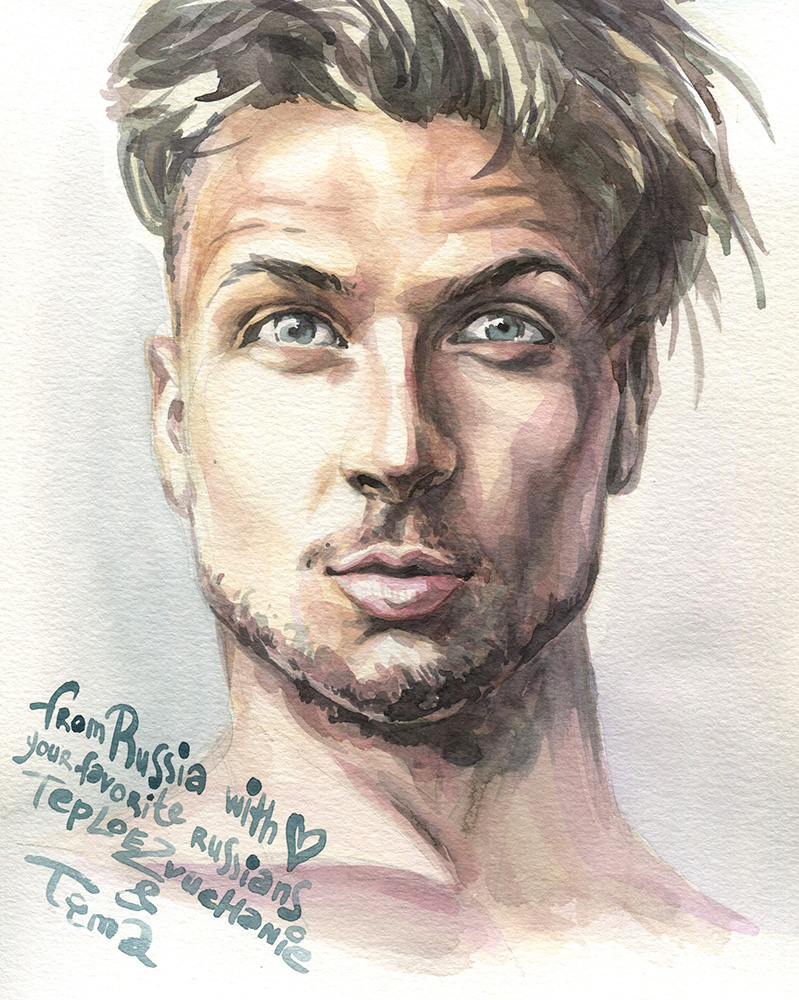
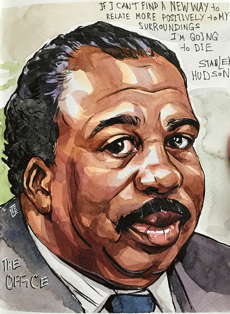
Let me note right away: this article is based on my own experience of using these watercolor brands and on my basic palette of colors. This is not only a comparison, but also a note about the peculiarities of each brand of watercolor. It's also a thought on wich style each watercolor brand fits. Most of the artwork for this article is portraits, since I've managed to paint in this genre with all four brands.
Nevskaya Palitra
In Russia acquaintance with watercolor most often begins with the Nevskaya Palitra. In this article I'm just talking about how it was a start for many of us. Today, these paints have become more complicated. In any case, I wouldn't call them watercolors for beginners. The disadvantage of NP is that, in comparison with other paints, they can be pale, deaf or something. This is especially noticeable in complex mixes. By complex mixes, I mean those where three or more colors are involved in the batch. Such mixes can look dirt even in expensive brands but in the Nevskaya Palitra, sometimes three colors are enough to make the shade look withered and cloudy.
However, NP has a huge palette and almost every year new colors come out, beautiful and independent beyond any mixes. So in the Nevskaya Palitra it is better to use pure colors or in mixes of two colors maximum. Then everything is beautiful. Paints are not expensive, so take as many shades as possible to mix less. Another point — consider the tone of the paper. Try to take snow-white varieties. NP colors obviously look more withered on paper with a yellowish, creamy tint.
About the style — Nevskaya Palitra is traditionally perceived as an academic watercolor. With restrained colors, it is easier to make realistic sketches in natural, not flashy tones. A calm watercolor landscape or a pleinair walkout is for NP. Classical urban landscapes, you know, in such a "Petersburg color scheme" are also about it. Of course, you can draw both characters and a kid illustration with NP paints, but in these cases you will need to pick colors for your artwork really carefully. Some illustrations, drawn with a limited palette or in restrained natural shades, look expressive. It depends on what effect you want to achieve.
Official Nevskaya Palitra website
Van Gogh
Okay, Nevskaya Palitra is more for those who feel the color and don't unknowingly do dubious gray-brown-crimson mixes. Van Gogh is such a difference! This is more of a starter kit. It seems that there is a lot of pigment in these paints. It is enough to lightly pick up paint with a brush, and the color is already saturated. Sometimes even excessively, almost with a covering effect. Perhaps that is why at first they seemed to me rude, clumsy. There is such a word in English as vibrant, and this was exactly what Van Gogh's watercolor lacked. But this quality is known in comparison, so I did not attribute it to fatal disadvantages.
After a break of a year and a half, I returned to these colors again. And my opinion even improved. This watercolor is actually easy to take, even if you wet it a little bit. Yes, there are both white and translucent shades. But besides them, there is the Dusk series, in which all colors are granulated. These are those whose pigment in an aqueous solution precipitates and forms a peculiar texture. If you mix them with other colors, they transfer this feature to the whole mix. And finally, the mix itself is rich, intense. Once you have kneaded, you can use it several times. Mixes of three colors, if they do not contradict each other, are strong and not dirty.
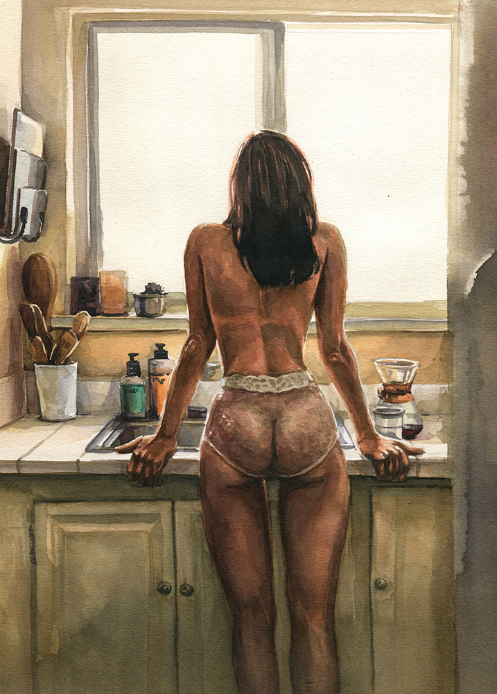
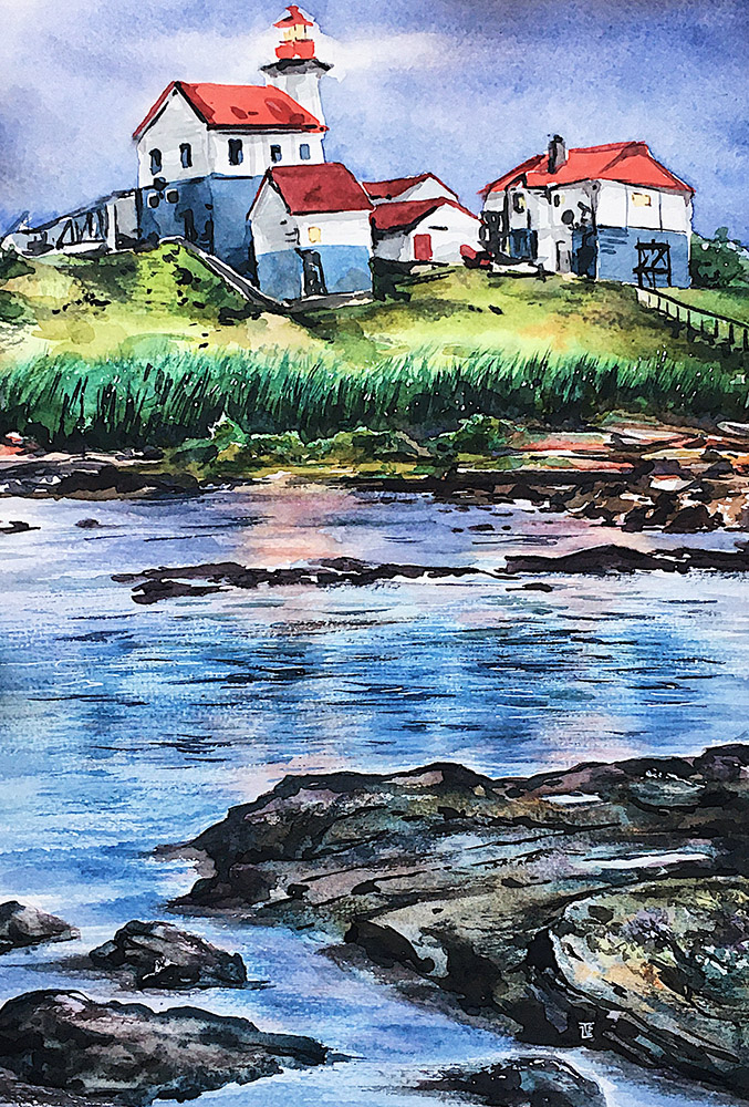
Van Gogh universal watercolor. It can be used for drawing anything, and artpiece will turn out well. I drew portraits and characters and landscapes — and in all directions I was satisfied with the results. Due to saturation, the colors are slowly consumed, and the painting looks moderately dense. If draw with layers, the tone is gained literally in 1-2 overlaps. Therefore, the art comes out juicy. In addition, I am delighted with the series with granulation. Love to use this effect!
Pinax
Pinax is another cool starter kit option. This is a Russian brand, but the paints are produced in Korean factories. Korean paints are known for their brightness. And Pinax is also bright, sometimes even poisonous. In terms of pigment saturation, they are not the same as Van Gogh, but also intense. Pinax has a lot of frankly whitening, soapy and translucent colors. But they have unexpected shades that are not found in other manufacturers. For example, an unusual mix of three colors is suitable for portraits — Nickel Titanium, Bordoux and a drop of Deep Blue. Or a light greenish-gray shade of Davy's Gray — it varies greatly from manufacturer to manufacturer. Pinax is a good choice.
In 2020 Pinax organized mass product presentations in St. Petersburg art stores. I was lucky enough to work with them and represent the paints in the places. Even with the help of a standard dot-card with small drops of watercolor, I managed to draw art that was harmonious in color and contrast.
The general impression is that this watercolor is more suitable for decorative illustration. If you are characterized by beautiful stylized watercolor drawings, ornaments, characters — these are your option. Juicy and bright from the first layer. Because of this, layering techniques are well obtained, where the colors of the upper and lower layers are different. For example, you paint beige skin, and put a purple shadow on top. And a huge plus is the price: Pinax paints are cheaper than Nevskaya Palitra.
Shinhan
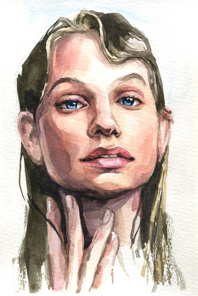
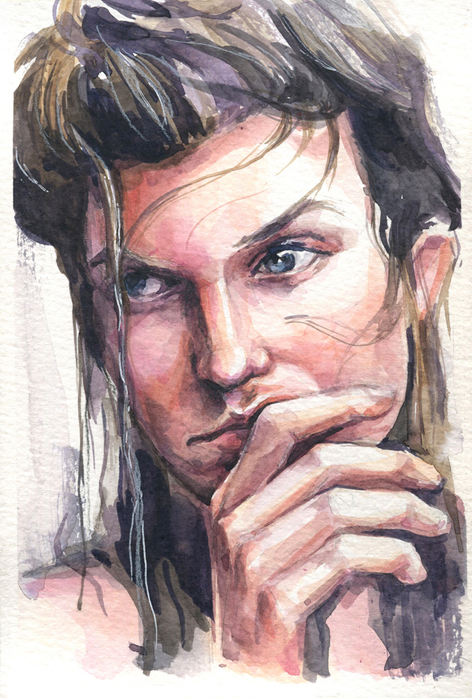
Before I discovered Van Gogh, my favorites were Korean Shinhan. I have a professional PWC series. Today I paint either with them or Van Gogh. In this brand, the palette of my popular colors is very transparent, and the colors are just vibrant! Bright but not acidic, beautiful in blends and not deaf. Even in complex mixes, they retain color and do not roll down to dirt. The colors are well saturated with pigment, but still weaker than Van Gogh. The taken color mix will quickly lose saturation from dilution with water.
Shinhan also has whitening shades, but I deliberately do not take them. They are not in my base palette. The cost of a cuvette or tube is more expensive than that of the same Van Gogh, but I'm not greedy to cash out on it. It’s a pity that a couple of years ago the brand changed its displacement and began to produce them in small tubes. Among my favorite colors is 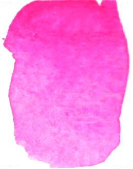 операopera. I often take it in portrait blends, as an example, see its use in this master class.
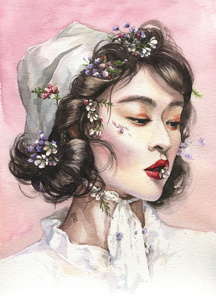
Painting with this watercolor turns out to feel more airy. For example, it is suitable for drawing a light watercolor landscape. Shinhan's watercolor portraits are transparent and fresh. The process of setting the tone in the layered technique is soft, so the transitions are smooth and thin. The skin in the drawings looks luminous, porcelain. Due to the airiness and simultaneous richness of colors, Shinhan is also suitable for stylized illustrations in the character genre.
instagram.com/shinhanart.official
Summary
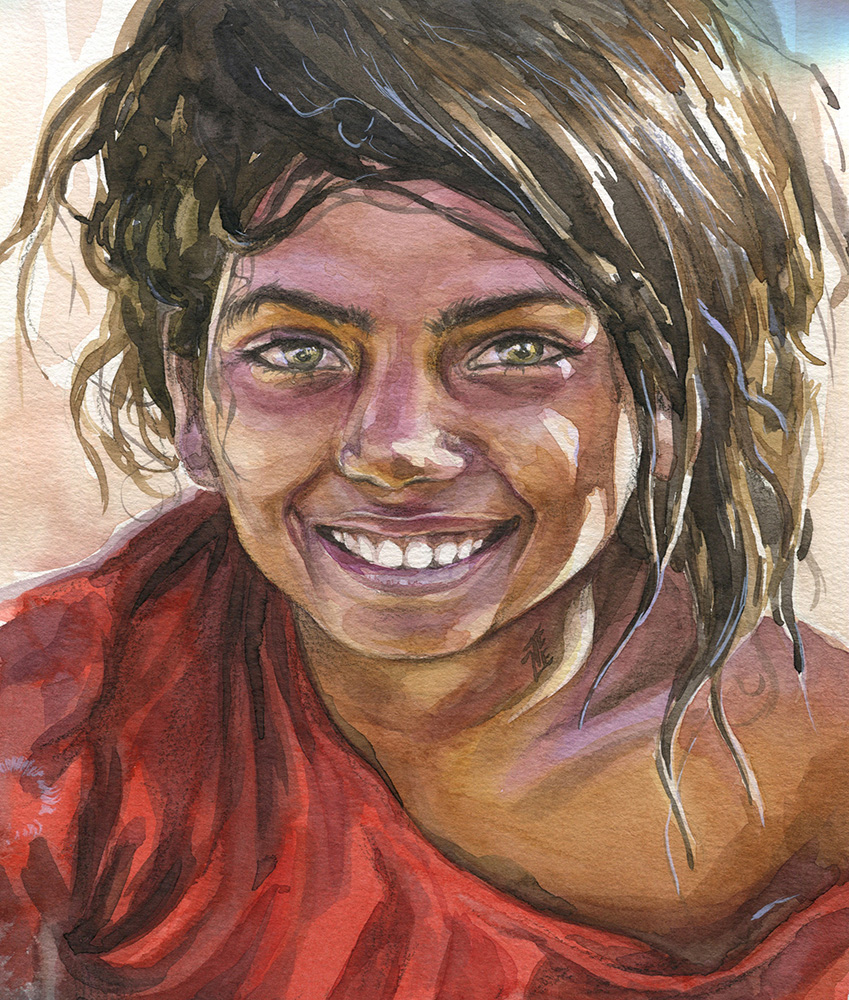
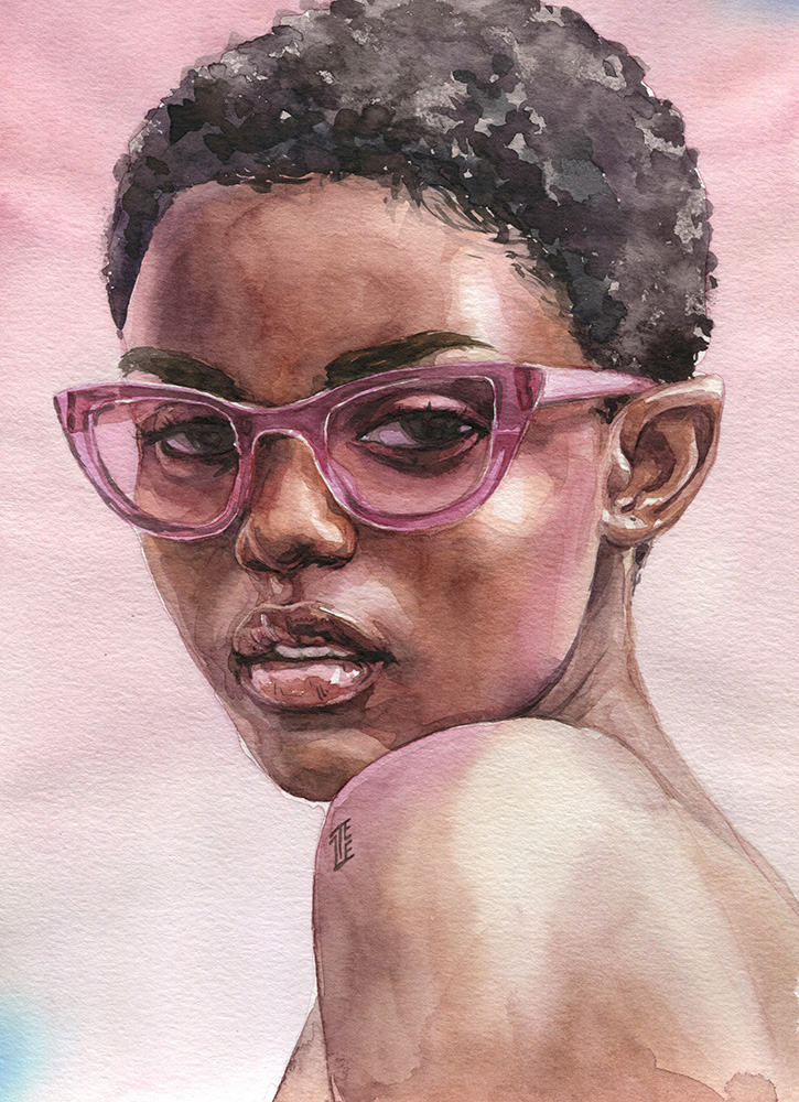
In this article, I do not mention food illustration and botanical painting, because I do not draw in these genres. But a brief summary will help you understand how each of the brands can be suitable for such work. I guess Shinhan and Van Gogh would be good for juicy ultra-realistic botany. And if you want to give the work a retro touch, like in old botanical albums, then it is better to take the Nevskaya Palitra.
I derived the described features from my own experience using paints. In addition to these four brands in my bins, a growing set of tubes from Daniel Smith and the legendary honey Sennelier are waiting in the wings. When I have accumulated pictorial experience in drawing with these brands, I will share about their features. In the meantime, here's a piece of advice for you: experiment and try as many as you can! Don't get hung up on one single brand. What if something else suits your style of painting? Don't try, you won't know. I wish you creative success and research excitement!
